Loungewear sold as a look, not as separate pieces.
Overview
Shopify store for an Egyptian loungewear and matching-sets brand, in English with prices in Egyptian pounds.
The whole store pushes one behaviour: buy the set. Collections are sorted by piece, the product page suggests what completes the look, and a buy-2-get-1 offer runs across the catalogue.
Details
Platform:
Type:
Stack:
Language:
Live Website:
The pages
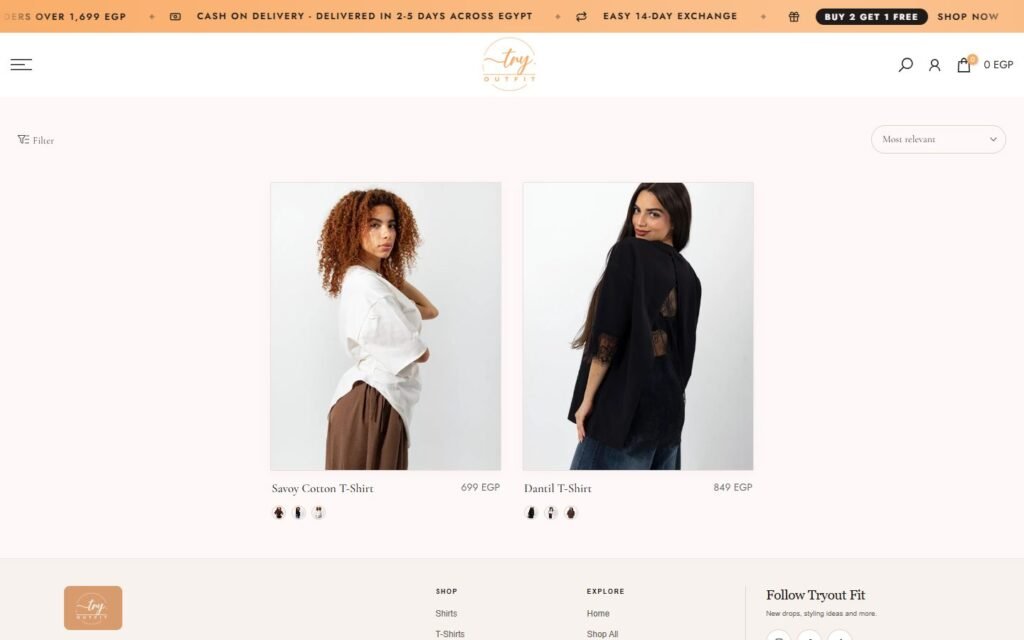
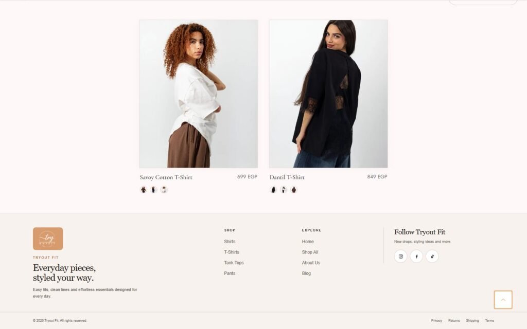
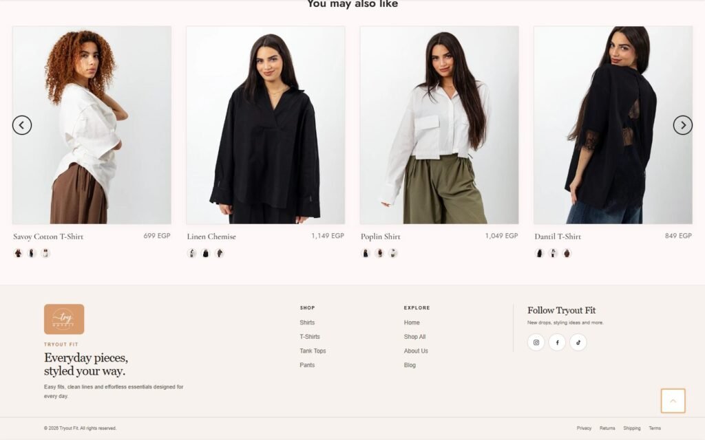
Real screenshots of the key pages, split into sections. Switch pages with the tabs, swipe or use the arrows, and click the middle image to see it full size.
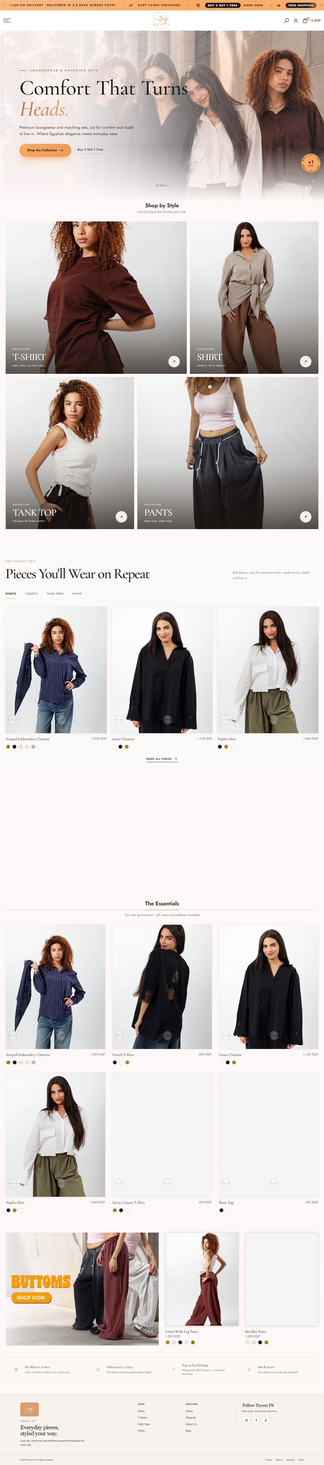
Hover to scroll through the whole home page
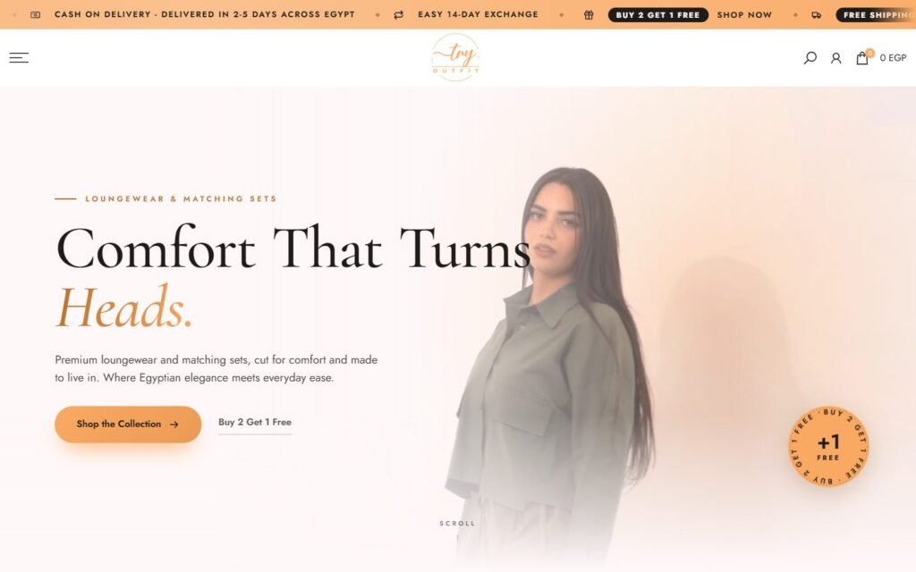
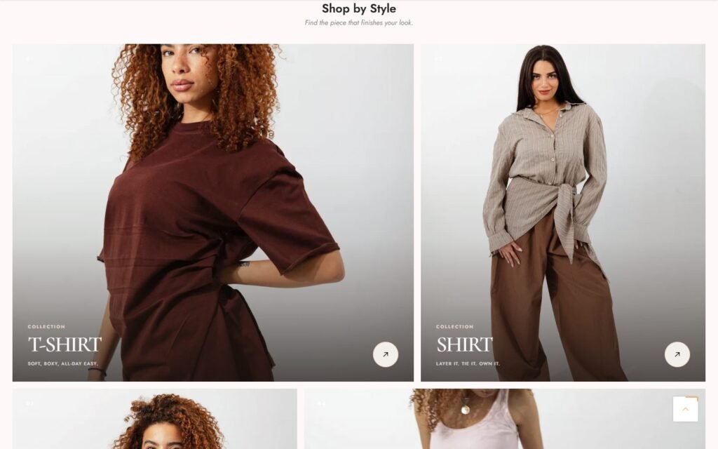
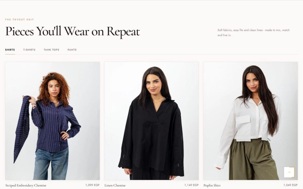
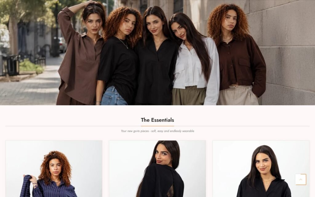
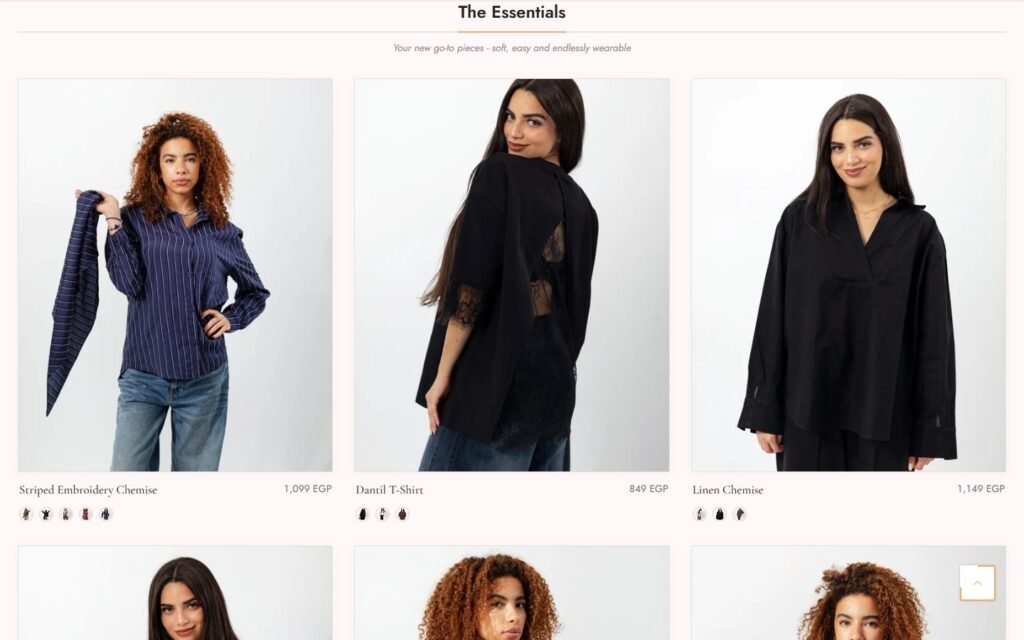
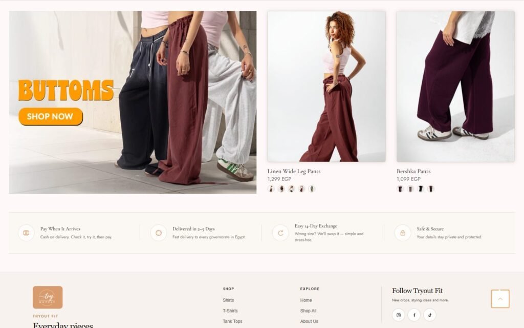
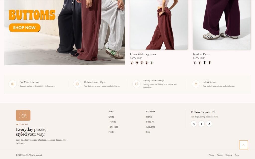
Inside the website
The parts of this build that do the actual work, and how each one is put together.
01
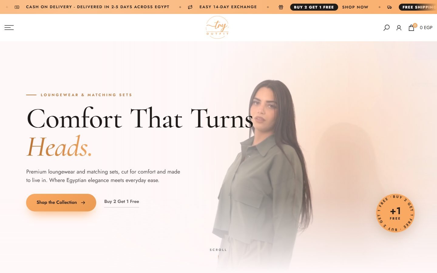
The three delivery promises, read before the first product
Cash on delivery, two to five days, fourteen-day exchange. In this market those three lines decide whether the visitor scrolls at all, so they sit above the hero rather than in a policy page.
How it is built
- Shopify on the Kalles theme with custom-built sections
- Announcement bar carrying the three promises, repeated as a trust row at the end of the page
- Rotating offer badge on the hero so the running promotion changes in one place
02
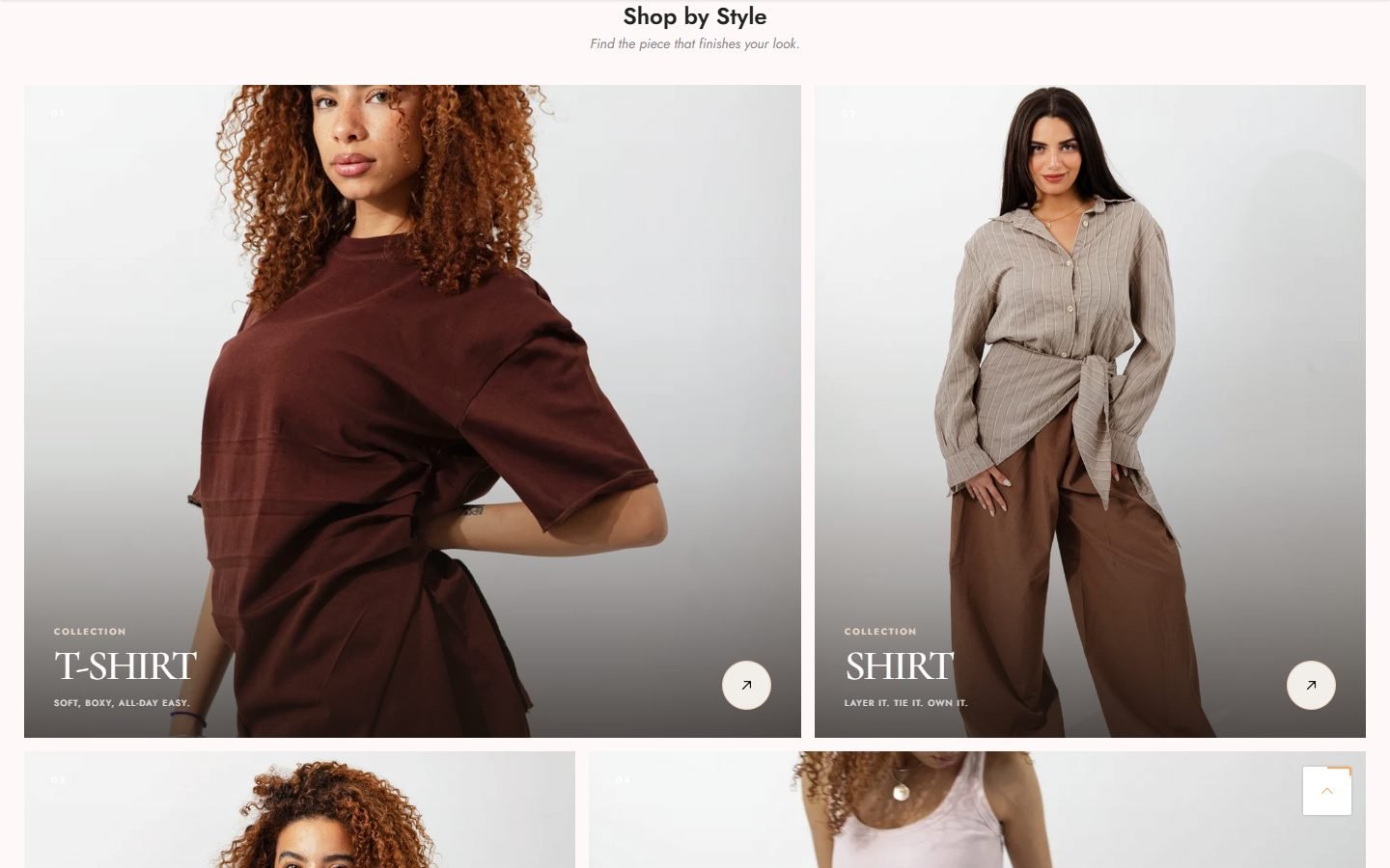
Browsing that reads like a lookbook
T-shirt, shirt, tank top and pants as numbered cards with a line about the fit. For loungewear the fit is the product, so the category list describes it instead of just naming it.
How it is built
- Collections list section with numbered labels
- Photography shot per collection rather than a product cut-out
03
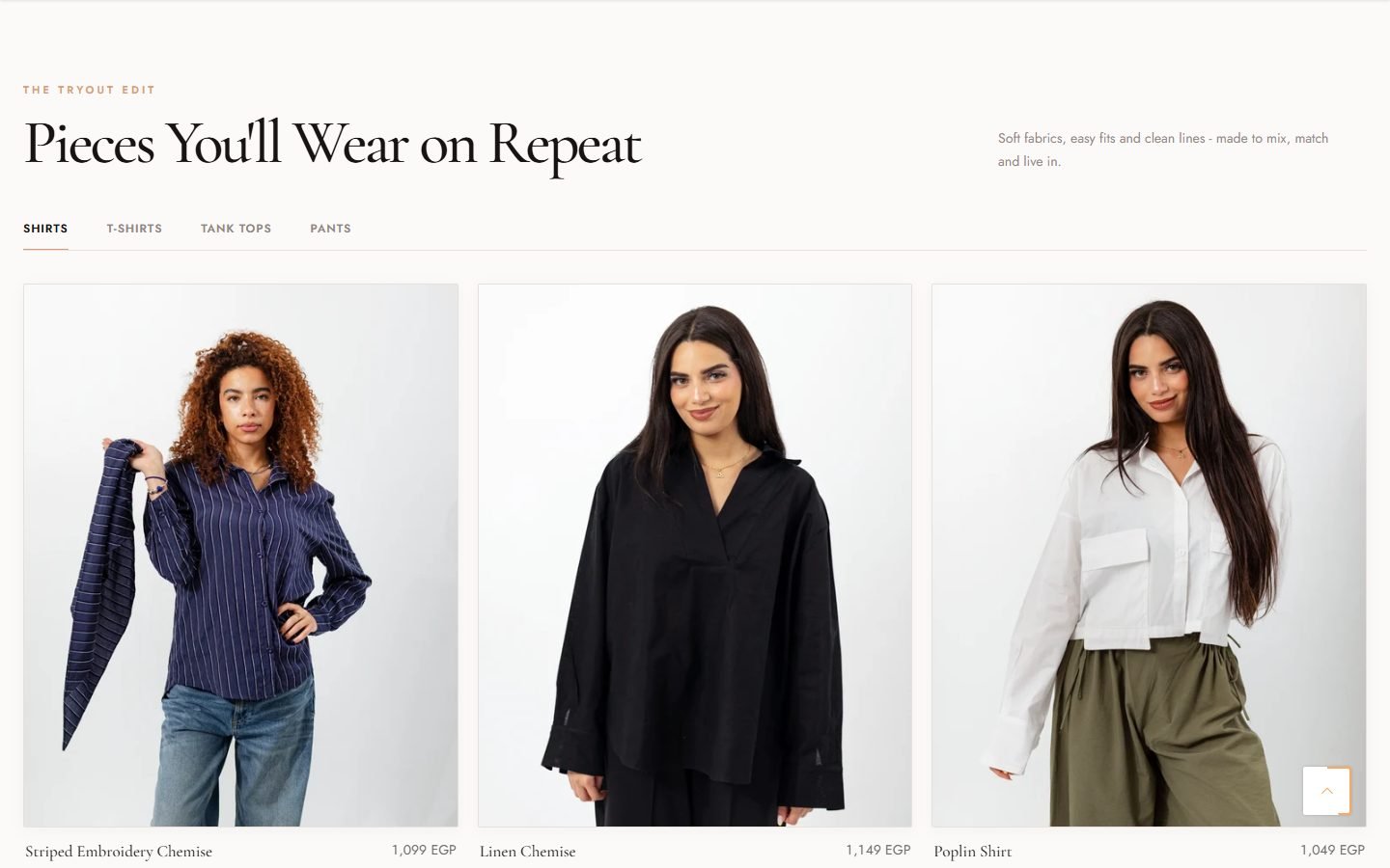
Four collections in the space of one
The Tryout edit holds every category behind tabs, so the home page shows the whole range without becoming four long rows the visitor has to scroll past.
How it is built
- Custom product tabs section
- Cards carrying price and colour options
- Essentials and bottoms blocks underneath for building the full outfit without the menu
04
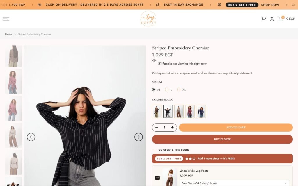
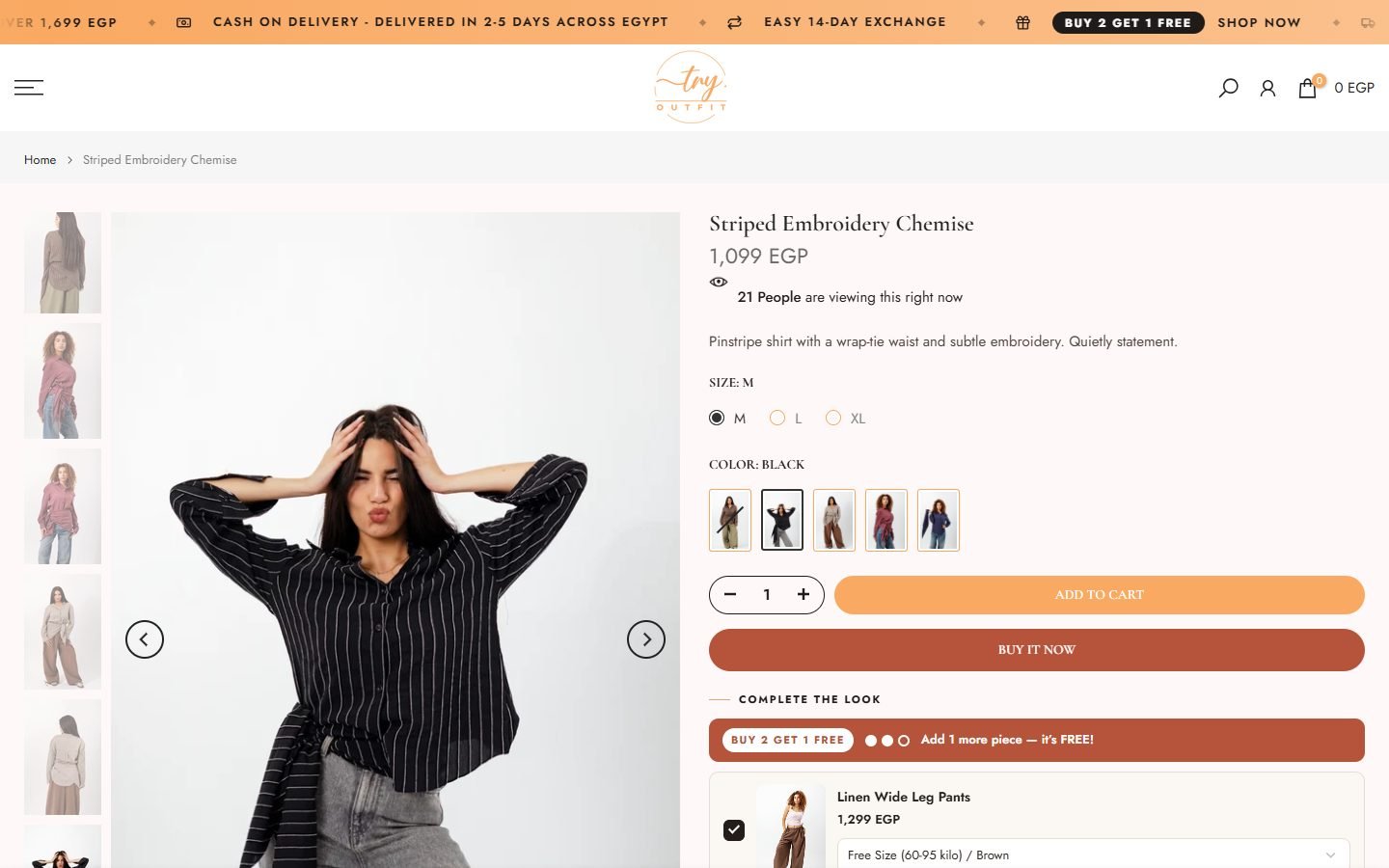
A product page that reminds you of the offer at the button
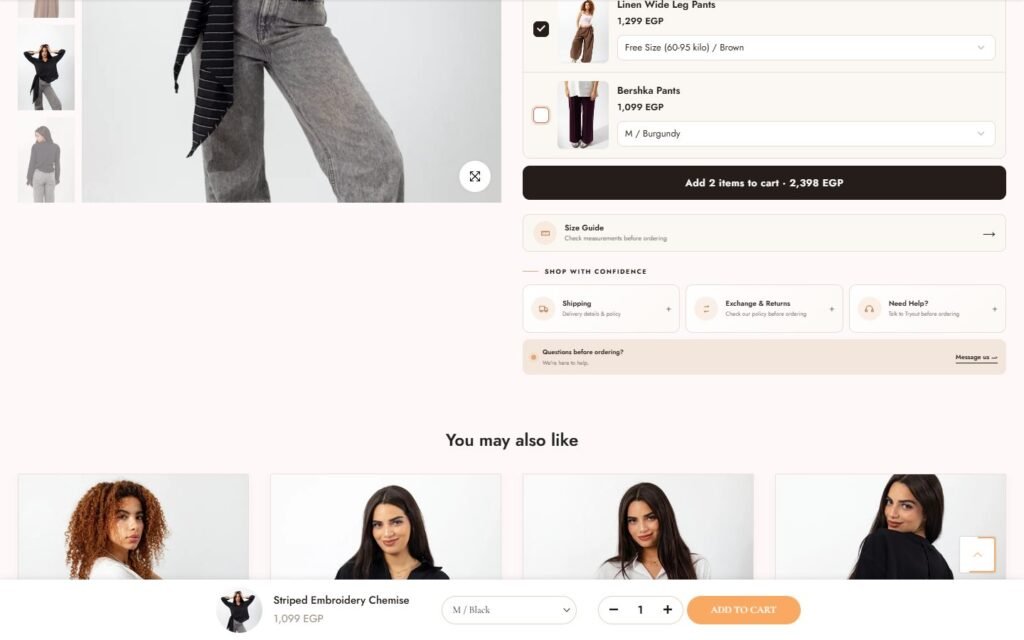
Size and colour pickers, a live viewer count, add to cart, and complete the look with the buy-two-get-one reminder placed directly under the button, which is where the second item is decided.
How it is built
- Product template with a thumbnail rail and a sticky add-to-cart bar
- Complete-the-look bundle block
- Shipping, exchange and help tabs under the buttons
Need something like this for your brand?
Tell me about your project. I will map the structure, the integrations and the launch plan.