The official Embryolisse store for Saudi Arabia, built for fast, product-first shopping.
Overview
Beauty e-commerce website with product-focused shopping experience.
Embryolisse is the French medical-grade skincare brand. This is its official store for Saudi Arabia. An Arabic storefront on Shopify that leads with best sellers and new arrivals, and reassures shoppers with reviews and flexible payment options.
Details
Platform:
Shopify
Type:
Beauty Store
Stack:
Language:
Arabic (RTL)
Live Website:
The pages
Real screenshots of the key pages, split into sections. Switch pages with the tabs, swipe or use the arrows, and click the middle image to see it full size.
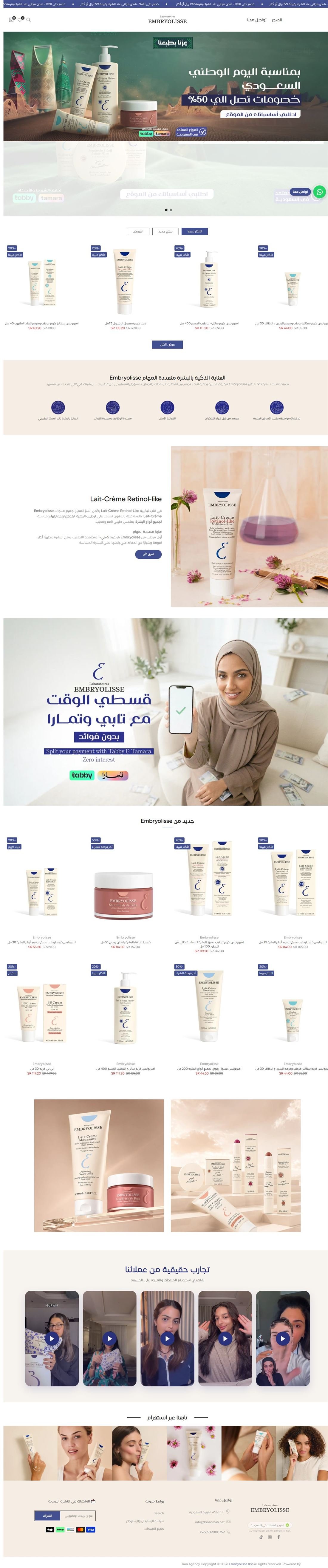
Hover to scroll through the whole home page
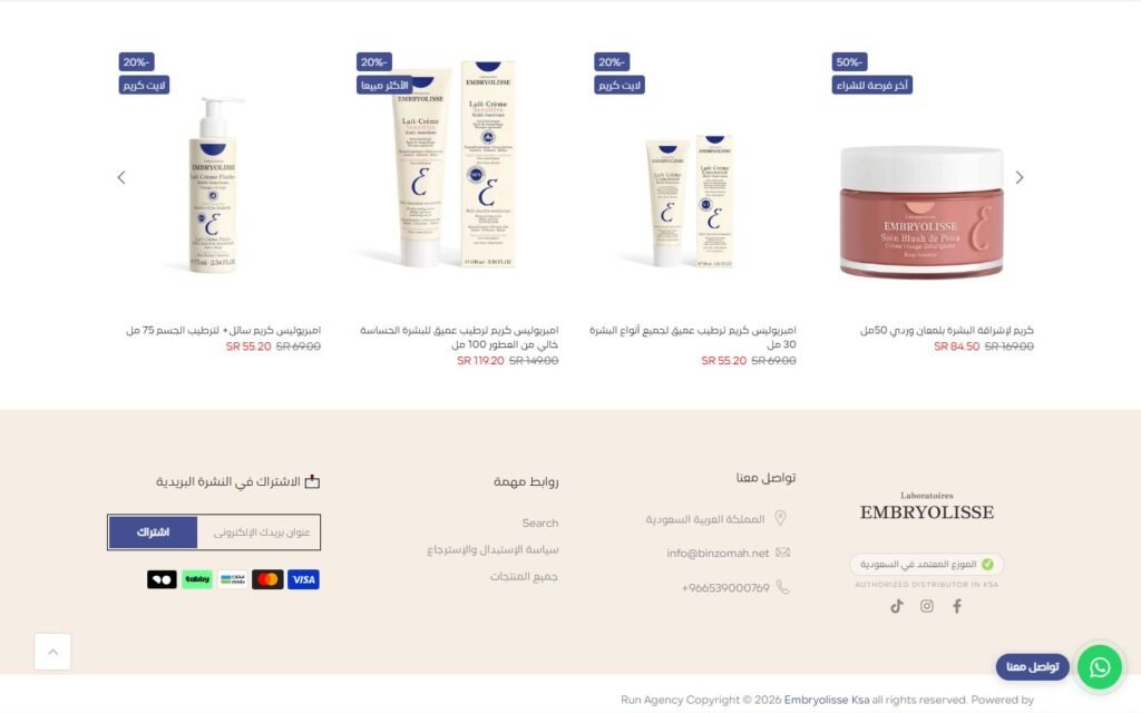
Inside the website
The parts of this build that do the actual work, and how each one is put together.
01
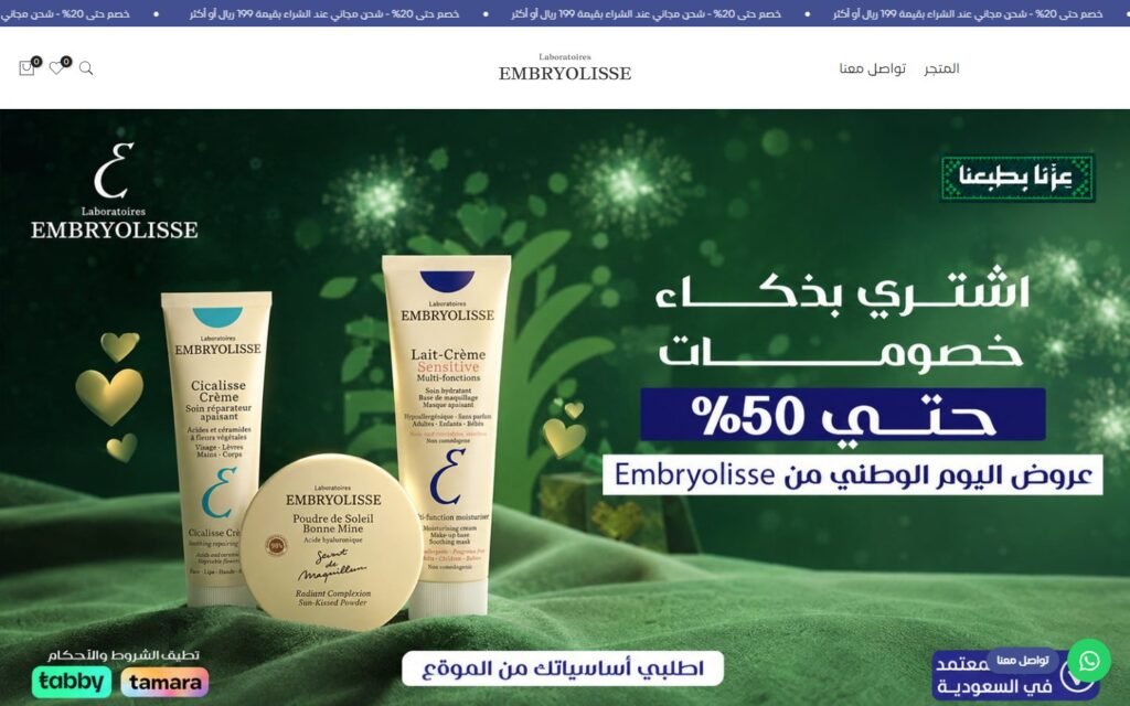
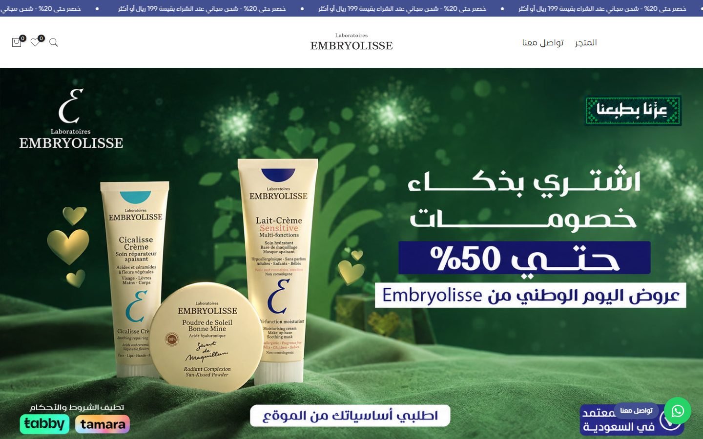
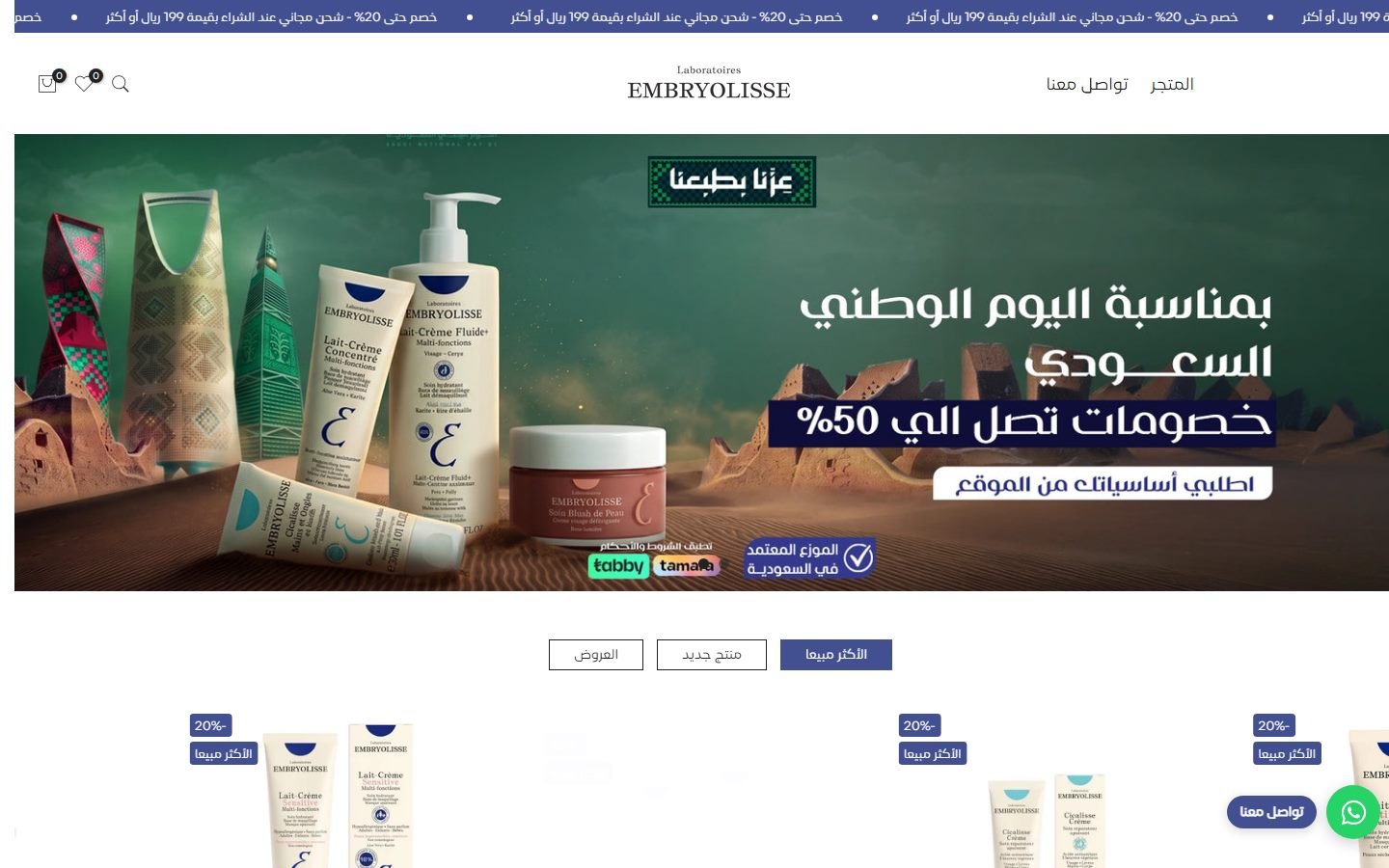
An Arabic store that answers price, trust and payment on the first screen
A Saudi beauty buyer decides fast, and the two questions are always the same: is this the real brand, and can I split the payment. Both are answered before any scrolling, next to the live campaign.
How it is built
- Shopify on the Kalles theme, fully right to left
- Scrolling announcement bar for free-shipping and discount thresholds, editable from the theme settings
- Authorised-distributor badge and the Tabby and Tamara logos sit in the hero, not buried in the footer
- Tracking wired on day one: Google Tag Manager, Meta Pixel and Microsoft Clarity
02
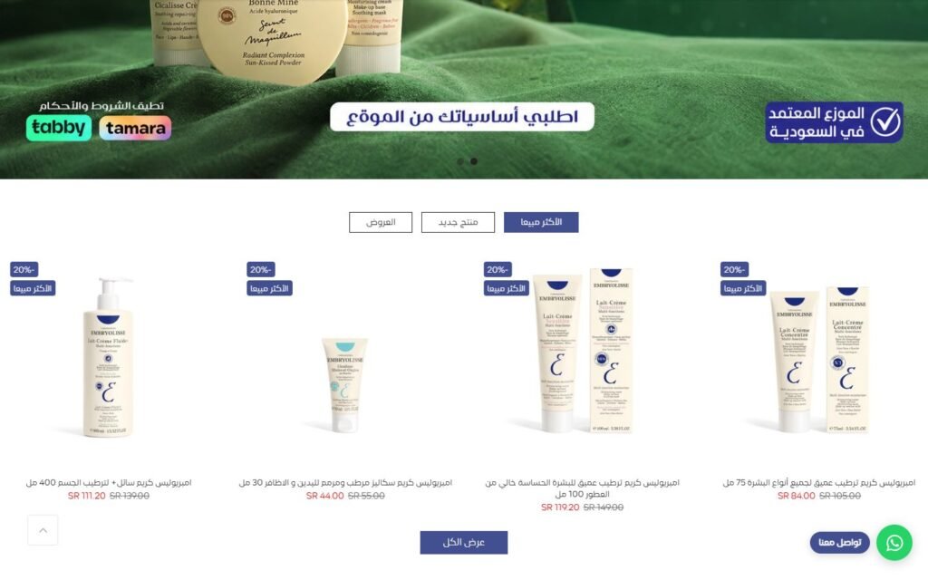
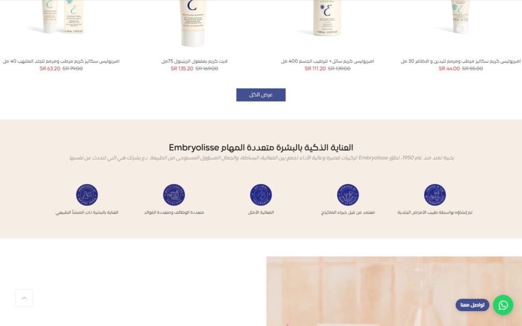
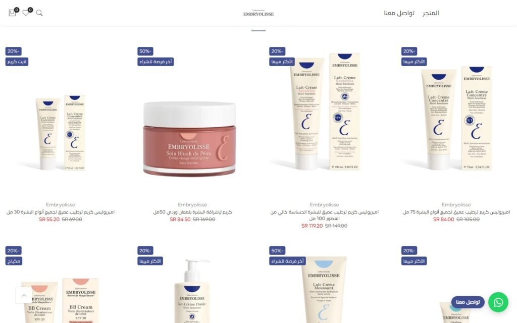
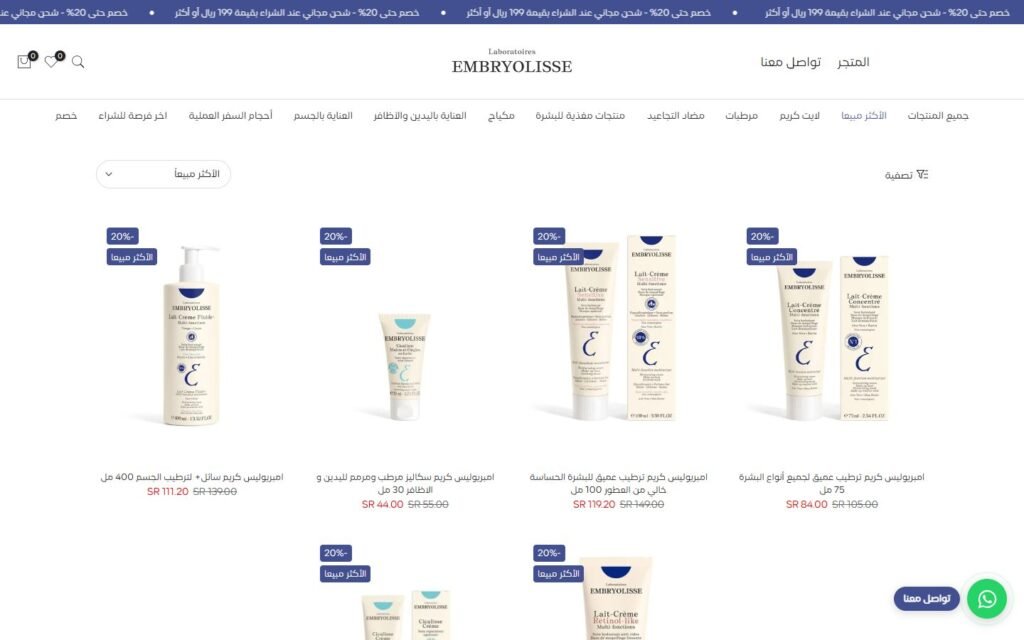
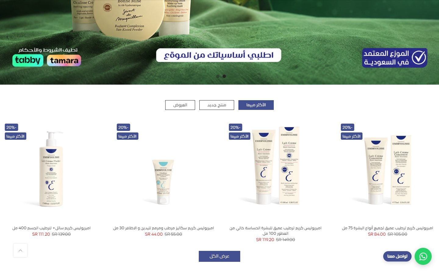
Three product sets in one block instead of three long rows
Best sellers, new arrivals and offers share a single tabbed section, so the home page stays short and the shopper switches instead of scrolling past what they do not want.
How it is built
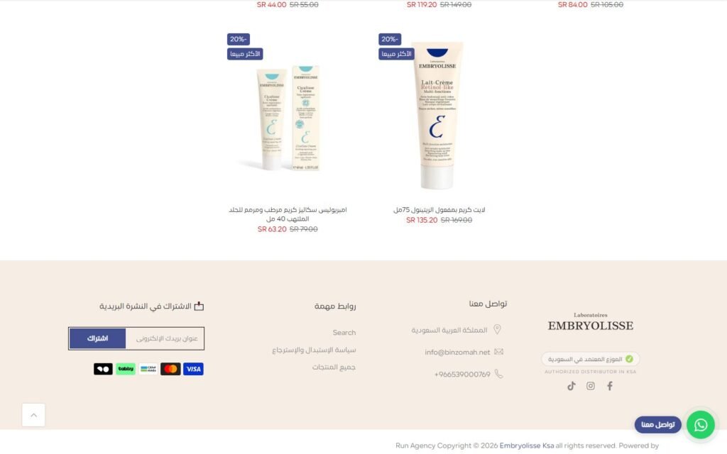
- One tabbed section fed by three Shopify collections, so the team changes what is featured by editing a collection
- Sale and best-seller badges with the compare-at price on every card
- View-all button into the full collection
03
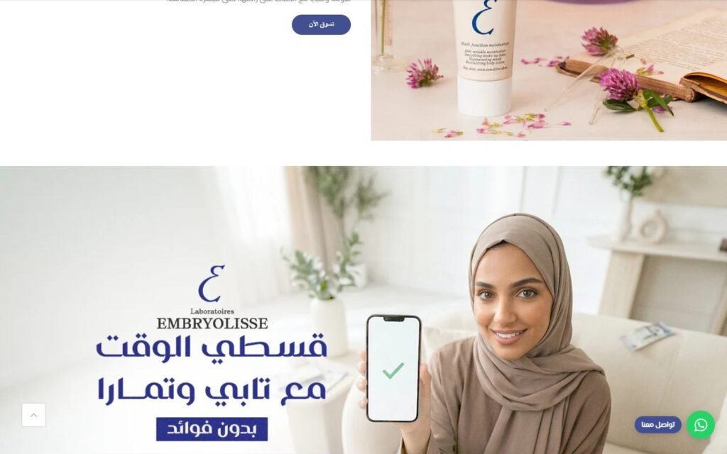
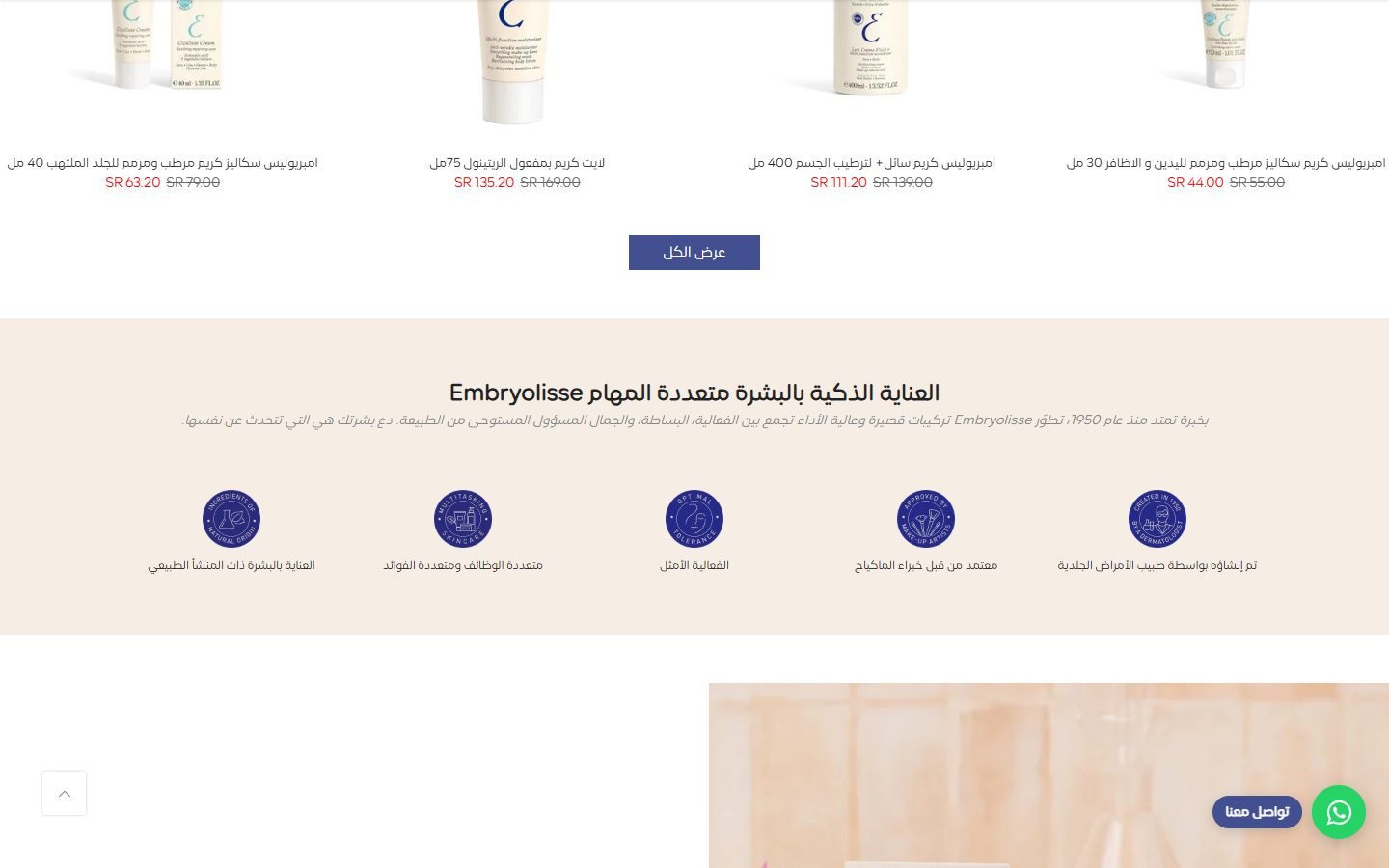
Trust and instalments placed before the long product lists
Five short promises (dermatologist-created, trusted by make-up artists, multi-purpose) and a buy-now-pay-later banner sit high on the page, where they still influence the decision.
How it is built
- Icon feature strip plus a lifestyle banner explaining Tabby and Tamara with no fees
- Banner links straight into the offers collection
04
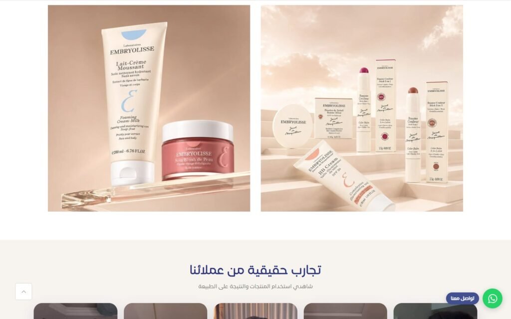
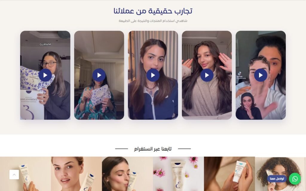
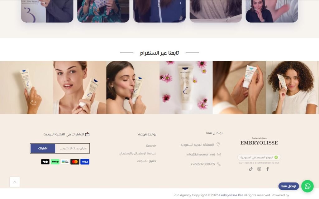
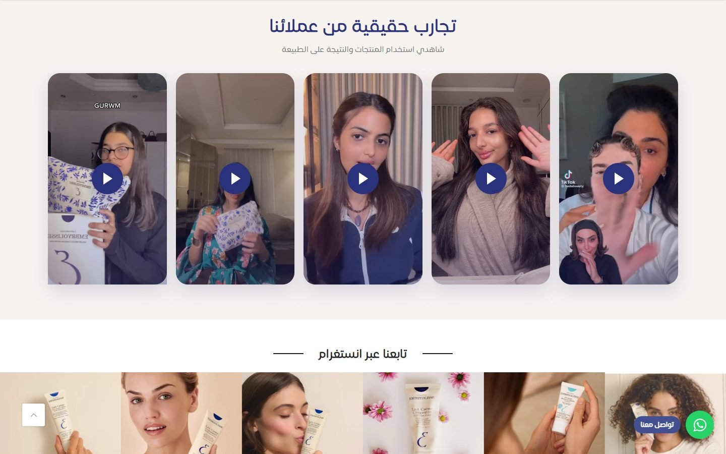
Real customer videos as the proof layer
For skincare, nothing converts like seeing results on a real face. A row of short vertical customer videos does the job that a review star rating cannot.
How it is built
- Custom section with a horizontal row of video cards
- Videos play inline on tap and are sized for mobile first
05
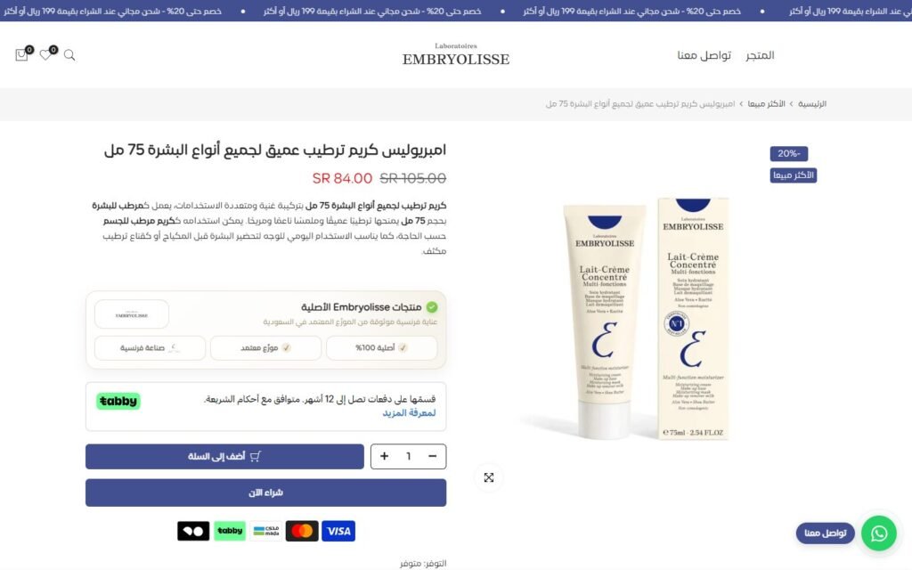
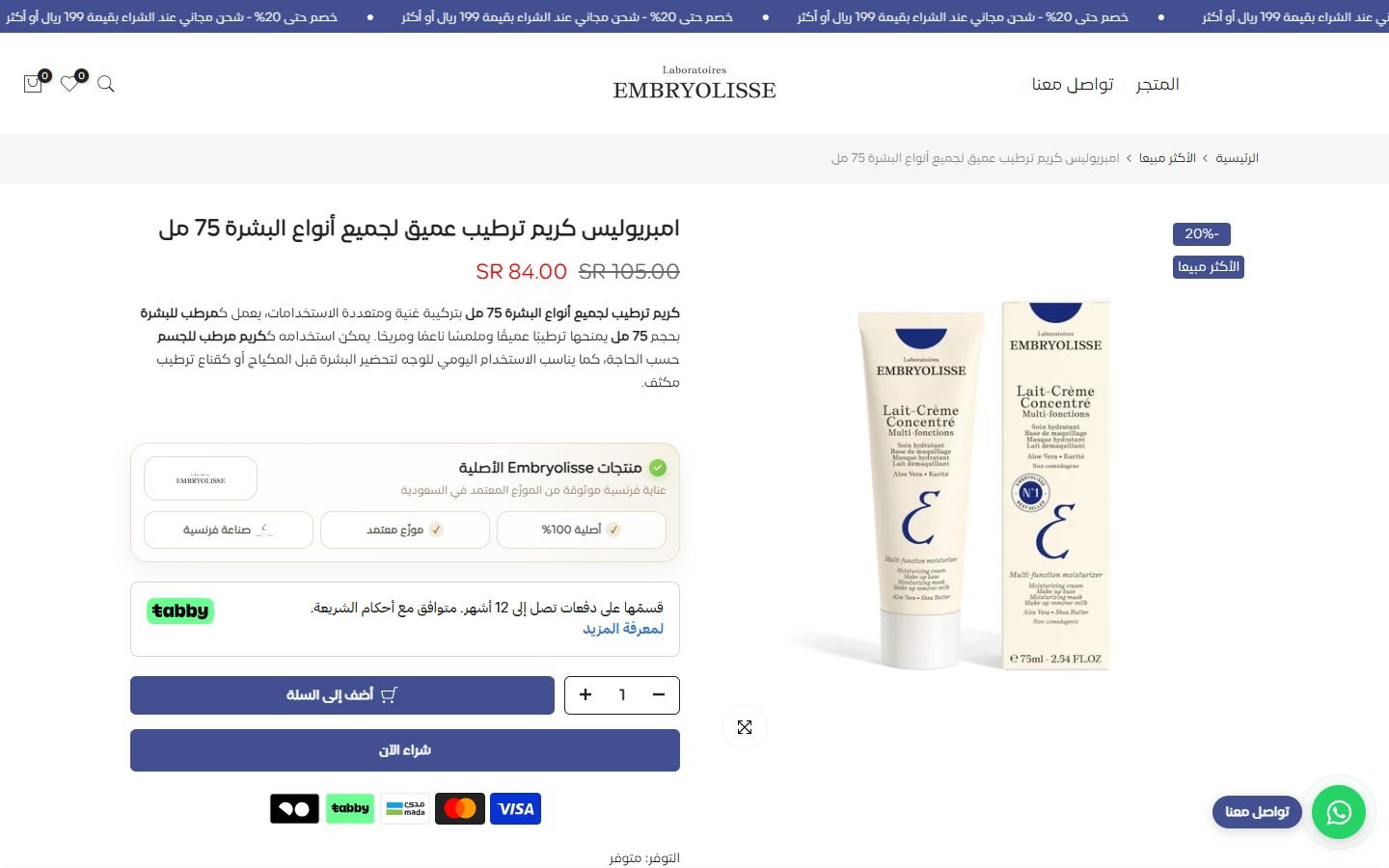
A product page that finishes the sale without scrolling
Price, discount, key benefits, trust badges, the Tabby instalment line, quantity and add to cart all sit above the fold, with the detail available underneath for whoever wants it.
How it is built
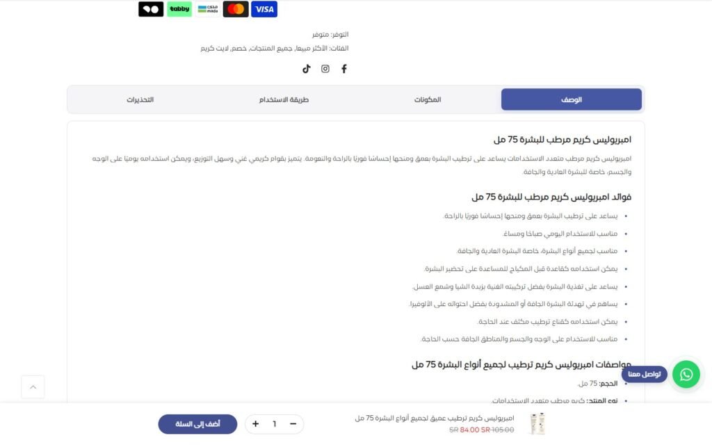
- Kalles product template with a sticky add-to-cart bar
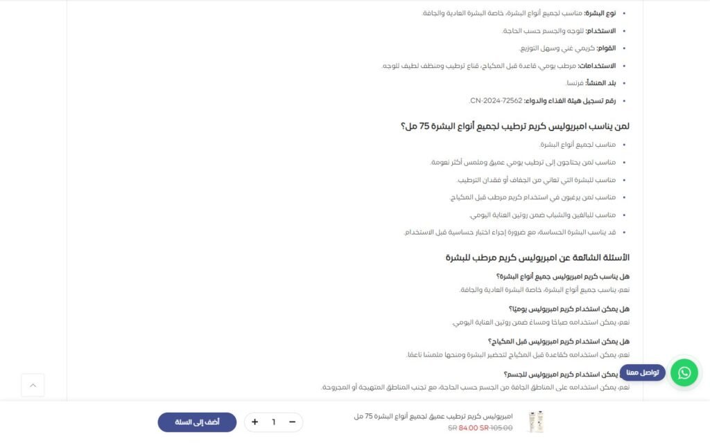
- Tabs for description, ingredients and how to use, plus an FAQ block
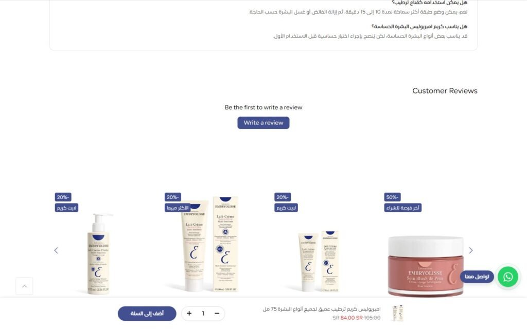
- Reviews section and related products below the fold
- Floating WhatsApp button on every page for the questions a page cannot answer
Need something like this for your brand?
Tell me about your project. I will map the structure, the integrations and the launch plan, then build it so it looks right and sells.