
A Saudi health and beauty market with a deep category structure.
Overview
E-commerce market website with Shopify storefront implementation.
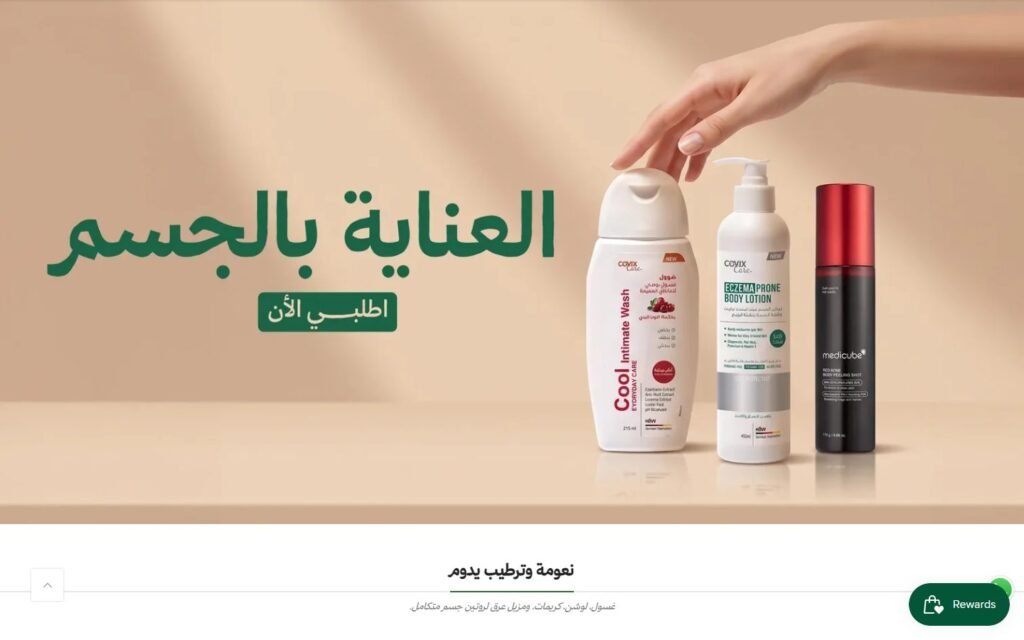
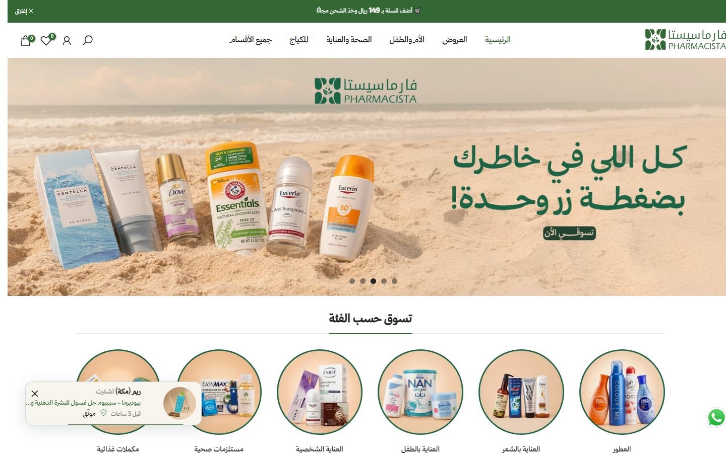
Pharmacista is a Saudi store for skin and hair care, supplements and home medical devices with fast shipping inside the Kingdom. The Arabic Shopify store covers skin and hair care, supplements, mother and baby, makeup and home medical devices.
Details
Platform:
Shopify
Type:
E-commerce Market
Stack:
Language:
Arabic (RTL)
Live Website:
The pages
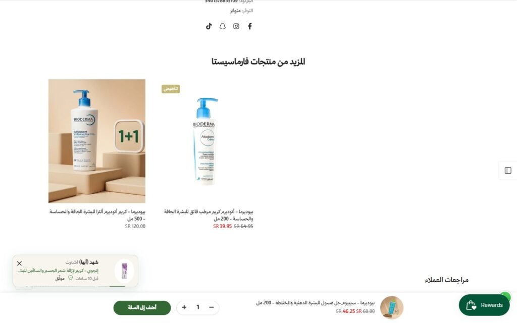
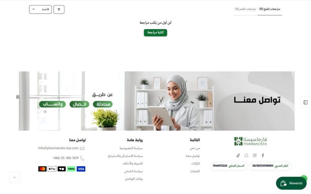
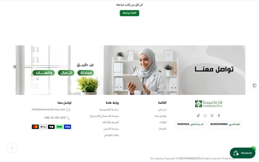
Real screenshots of the key pages, split into sections. Switch pages with the tabs, swipe or use the arrows, and click the middle image to see it full size.

Hover to scroll through the whole home page
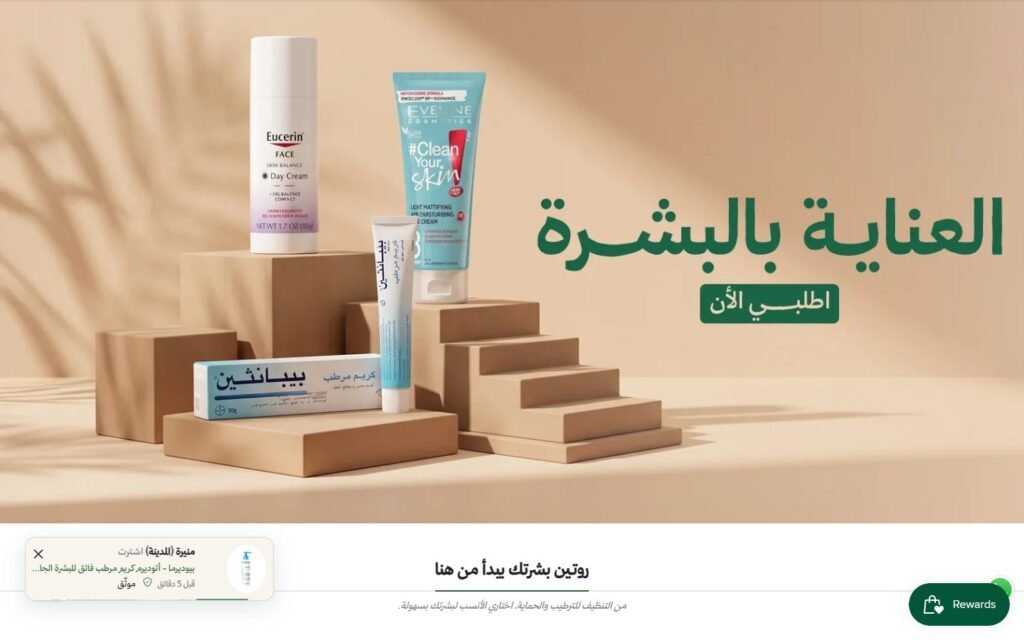
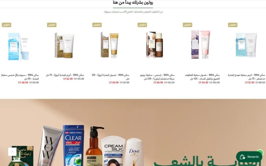
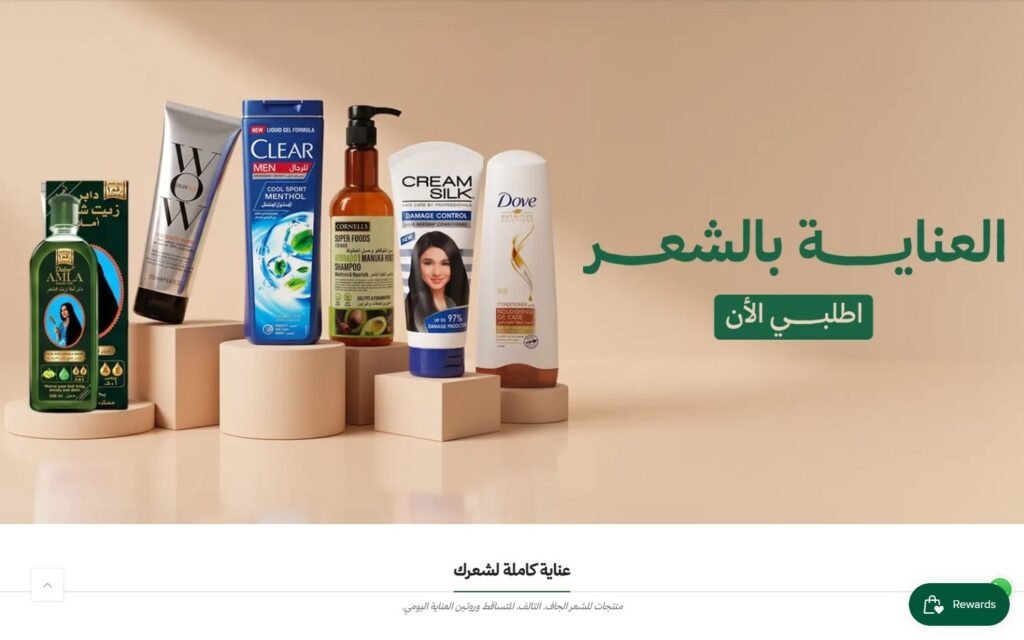
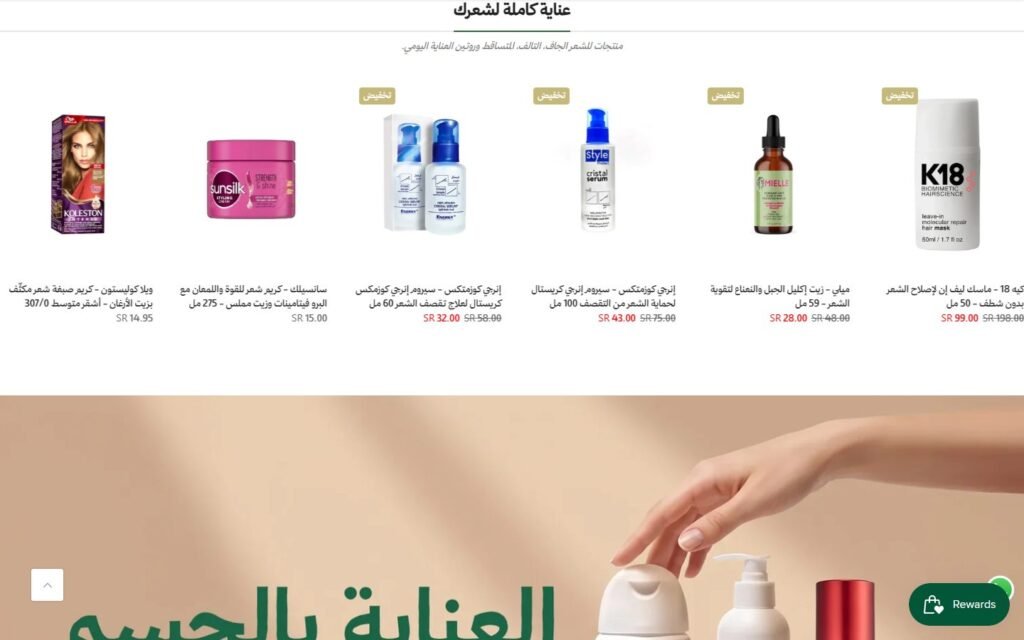
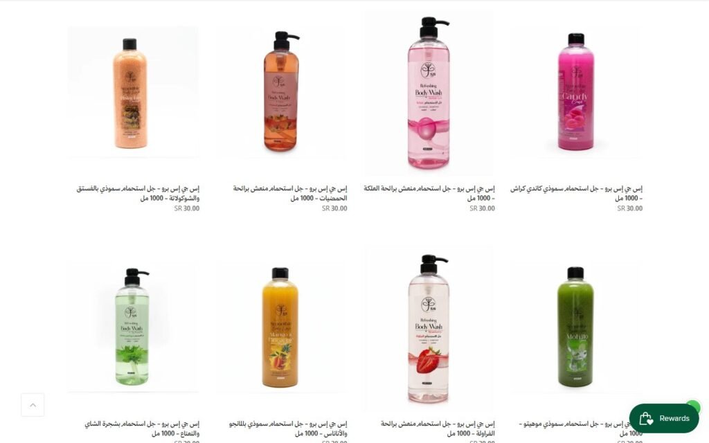
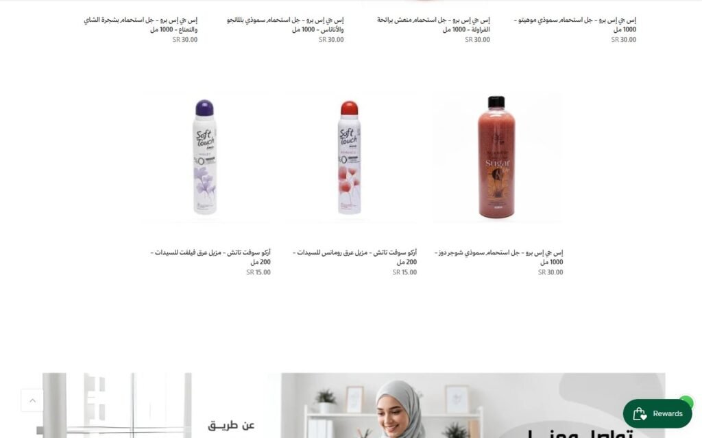
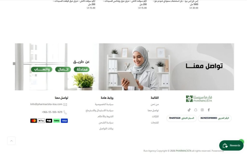
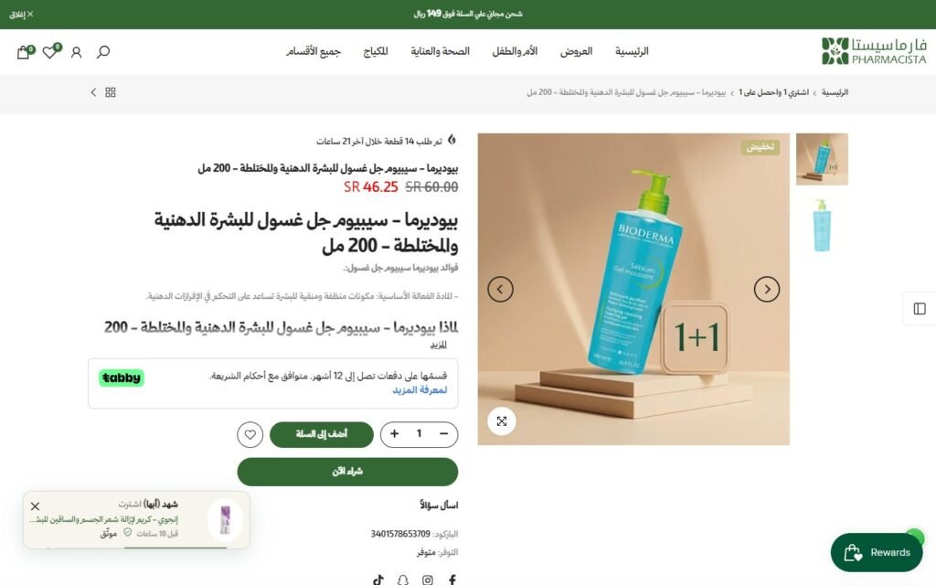
Inside the website
The parts of this build that do the actual work, and how each one is put together.
01
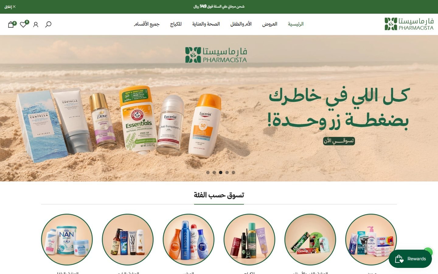
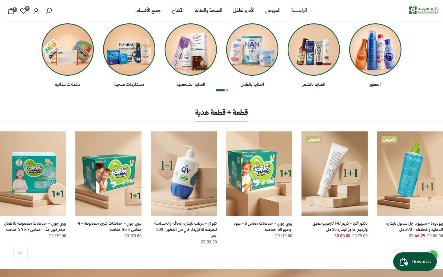
A menu built around needs, not around brands
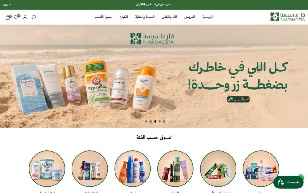
A pharmacy marketplace carries thousands of products, so navigation is the whole product. Offers, mother and baby, health and care, make-up and all categories are one tap from anywhere.
How it is built
- Shopify on the Kalles theme, fully right to left
- Mega menu grouped by customer need rather than by supplier
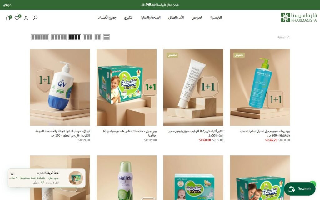
- Announcement bar carrying the free-shipping threshold
- Saudi commercial registration and VAT numbers in the footer, which first-time buyers check
02
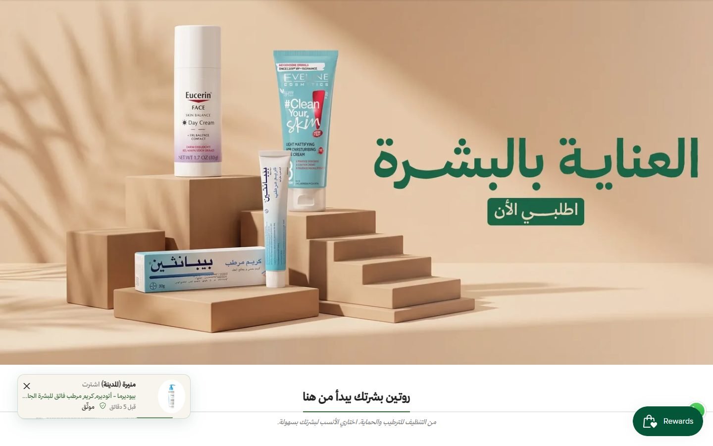
Offers and categories where the thumb lands first
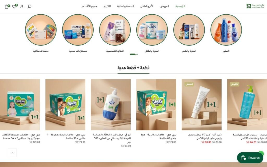
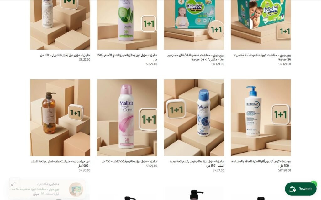
Round category tiles let a returning customer skip the home page entirely, and the 1+1 row puts the strongest deals above everything else.
How it is built
- Collections carousel with custom category images, swipeable on mobile
- Featured collection for the 1+1 and sale badges
03
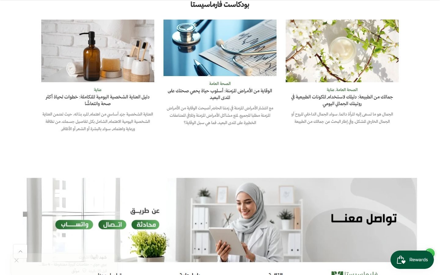
The page repeats one pattern the team can refill forever
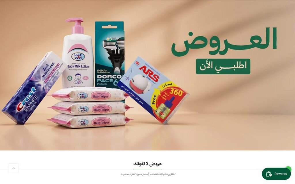
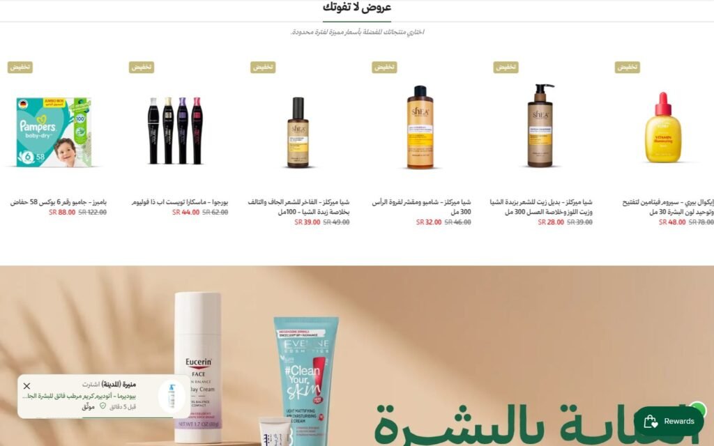
Skin, hair, body and baby each get a lifestyle banner followed by a product row. Every row answers what do I need for this, and every row is just a Shopify collection.
How it is built
- Alternating banner and featured-collection sections
- Changing what is featured means editing a collection, never the layout
- Short helper text under each heading
04
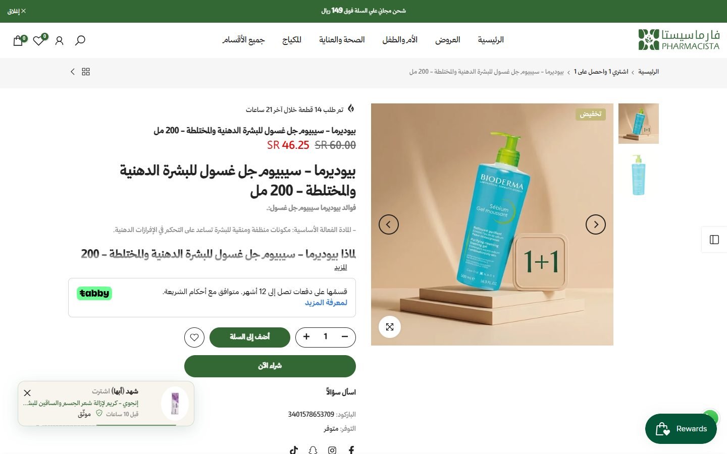
Advice, loyalty and three ways to ask a question
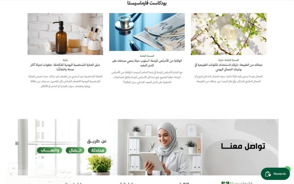
Pharmacy buying involves doubt, so the site carries an articles hub for search traffic and trust, a rewards programme for repeat orders, and a contact banner with WhatsApp, phone and live chat.
How it is built
- Blog section pulling the latest articles automatically
- Smile.io rewards button on every page
- Contact banner with three channels instead of one form
05
A product page that finishes the sale above the fold
Price with discount, the Tabby instalment line, quantity, add to cart and buy now, with the gallery beside them and the detail underneath.
How it is built
- Kalles product template with breadcrumbs and a sticky add-to-cart bar
- Wishlist and share, reviews block, and related products
- Mada, Visa, Mastercard, Apple Pay and Tabby shown at checkout and in the footer
Need something like this for your brand?
Tell me about your project. I will map the structure, the integrations and the launch plan, then build it so it looks right and sells.