A travel agency that sells trips, events and visas, with every request landing on WhatsApp.
Overview
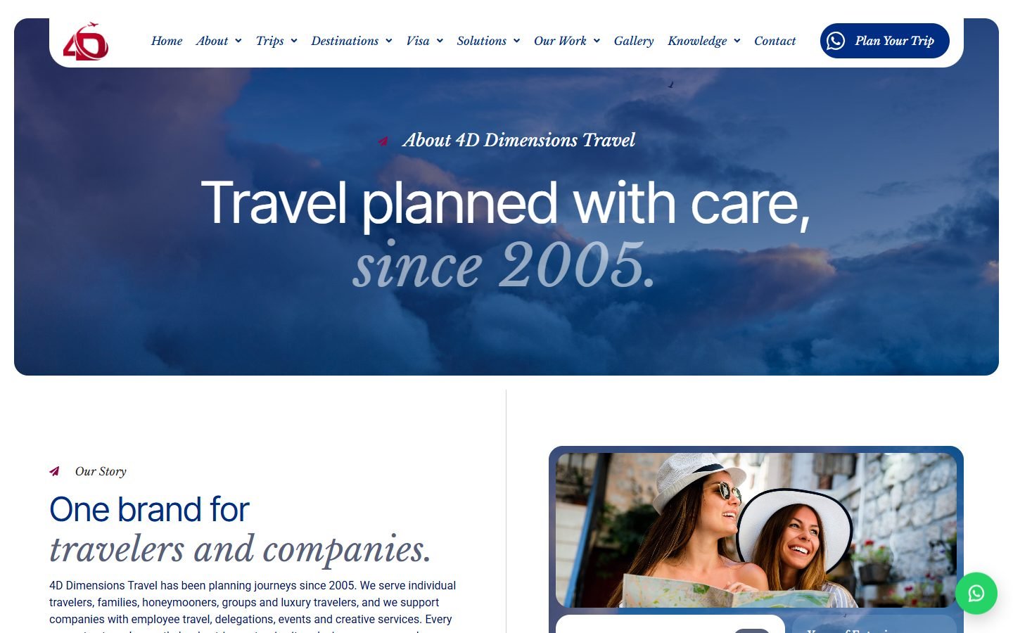
A full website and request system for 4D Dimensions Travel, an Egyptian travel and events company working since 2005: trips in Egypt and abroad, Umrah programmes, corporate travel, conferences and visa services, with branches in Egypt, Turkey, Spain and the UAE.
The brief ruled out an online checkout from day one. Travel here is quoted, not sold off the shelf, so the whole site is built to end in a conversation: every trip, destination, service and visa page carries a WhatsApp button and a trip-request form, and a request becomes a record in the dashboard instead of an email that gets lost.
The second rule was that the client’s own team edits everything. Trips, destinations, services, case histories, client logos, events, visa guides, branches, the counters and the director’s message all sit behind one “4D Site” screen in the dashboard, so nothing on this site needs a developer to change.
Details
Platform:
Type:
Stack:
Content:
Booking:
Live Website:
The pages
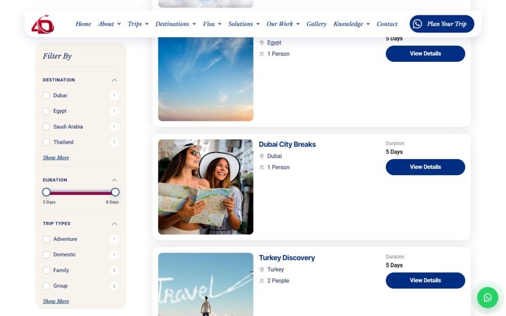
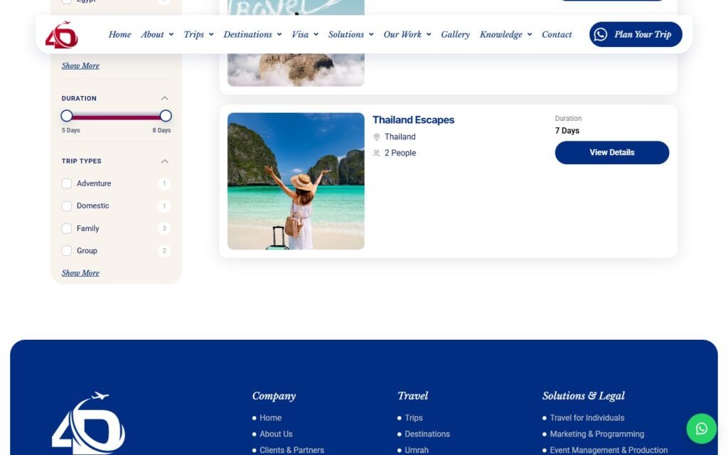
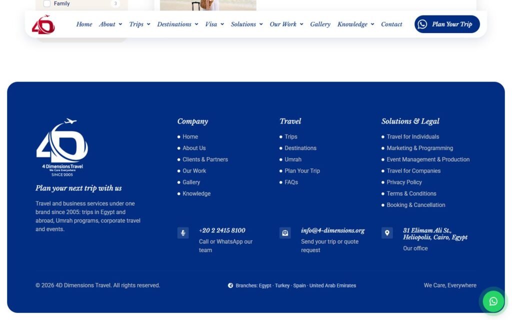
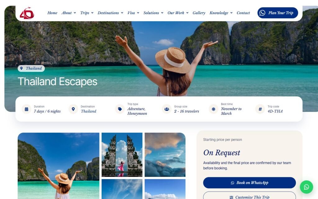
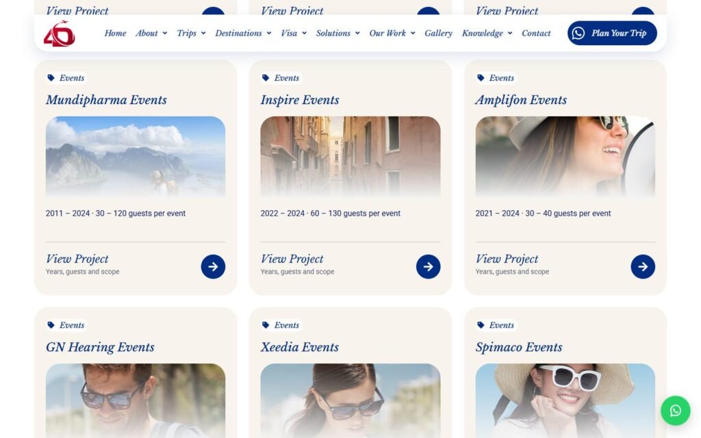
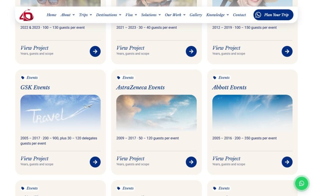
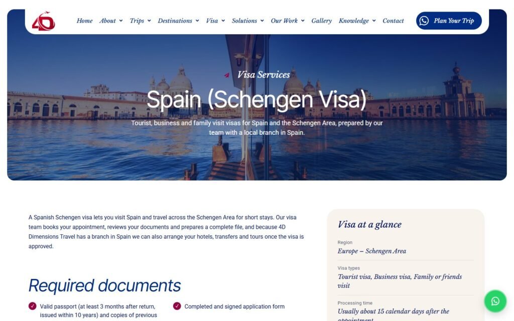
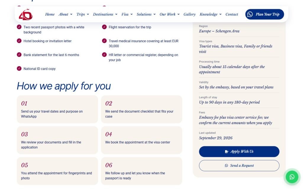
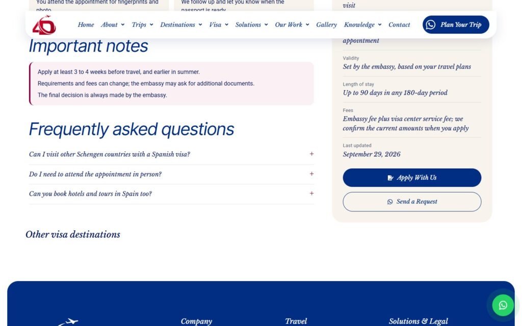
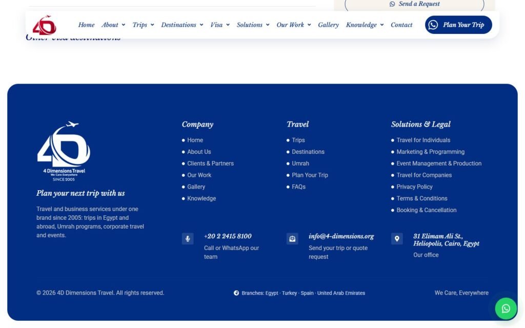
Real screenshots of the key pages, split into sections. Switch pages with the tabs, swipe or use the arrows, and click the middle image to see it full size.

Hover to scroll through the whole home page
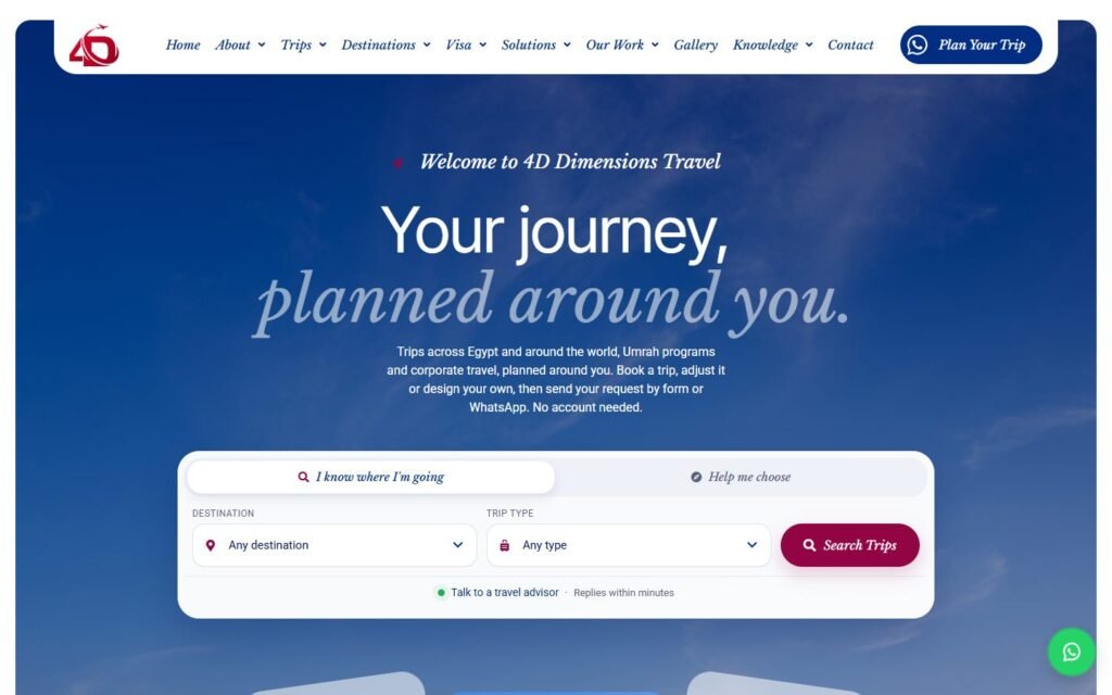
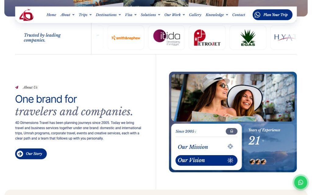
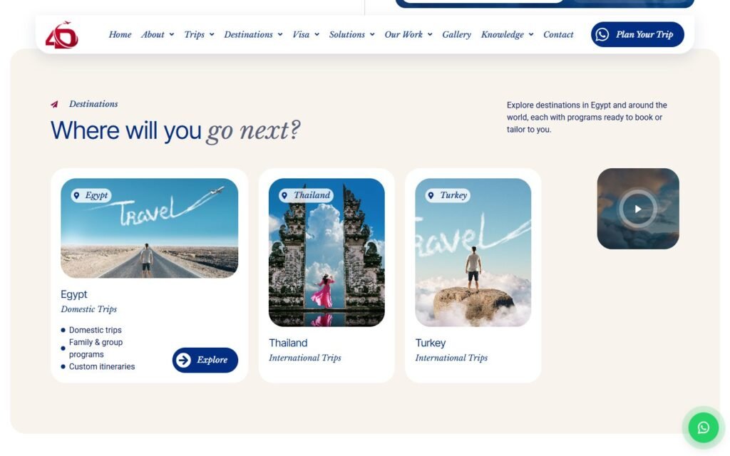
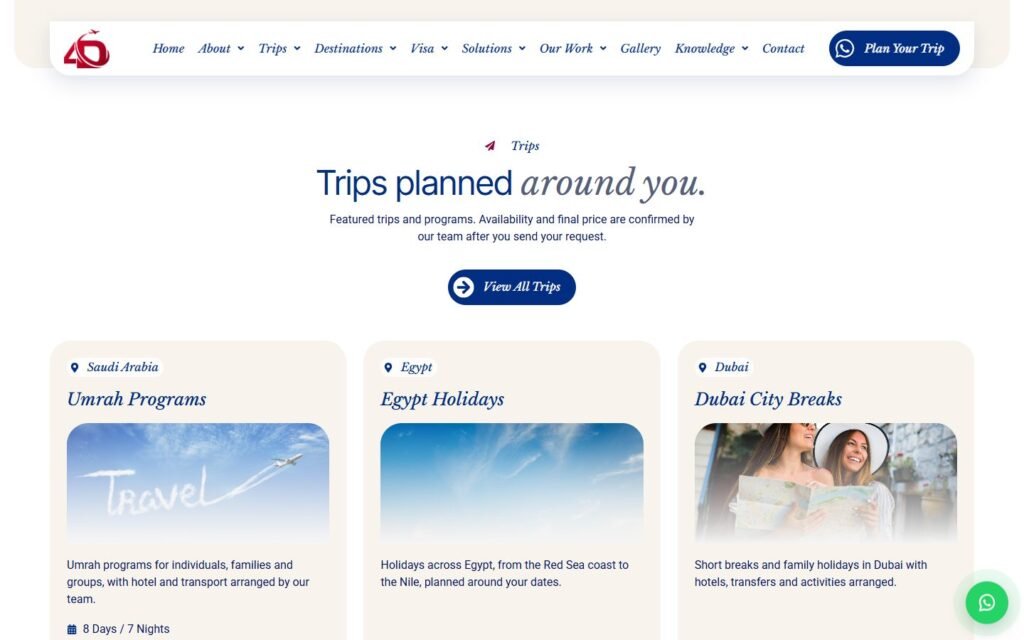
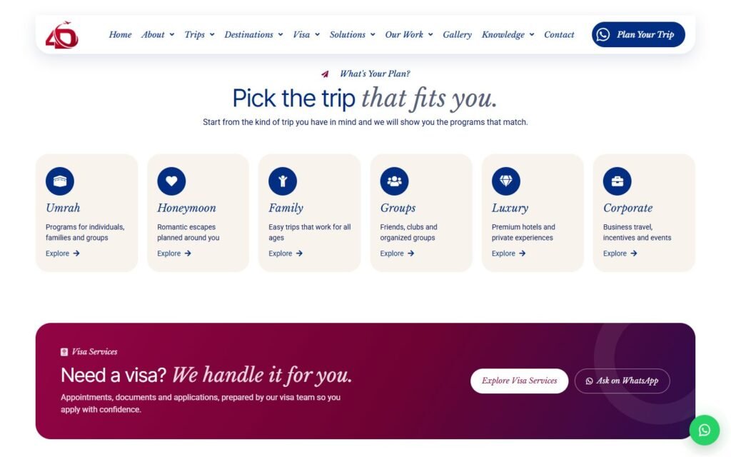
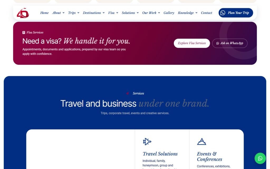
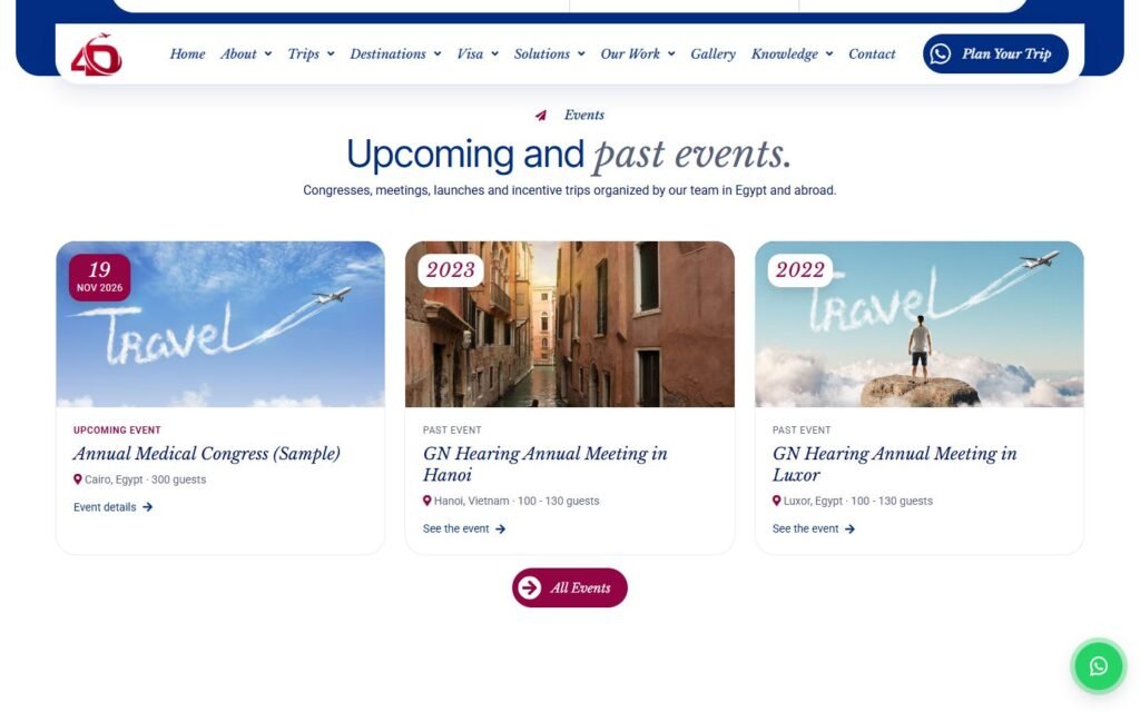
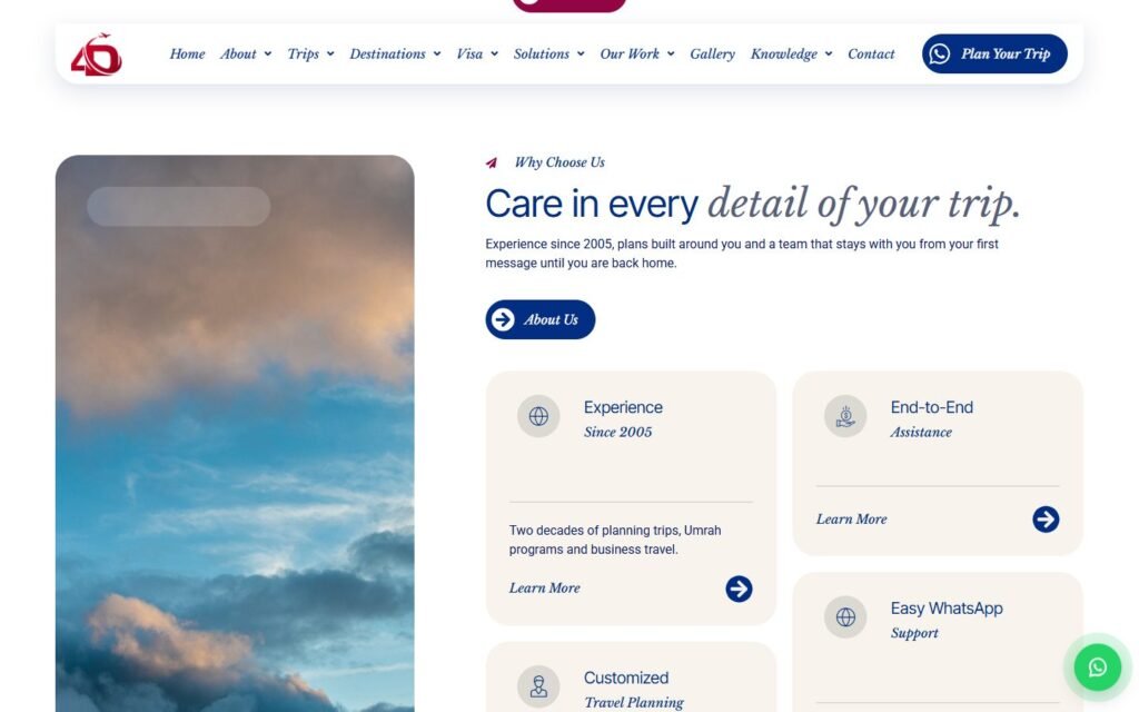
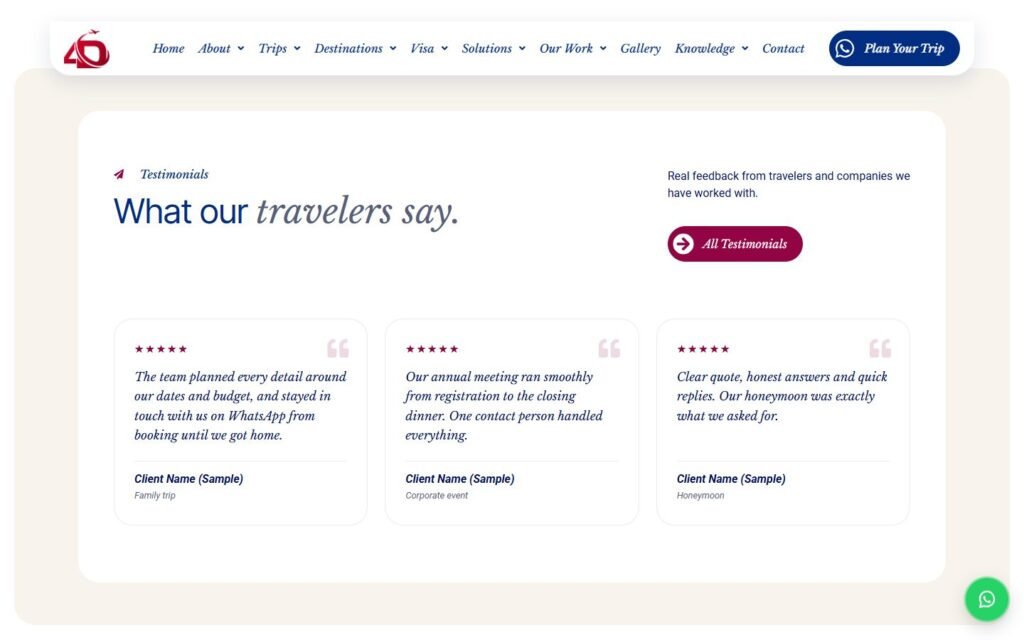
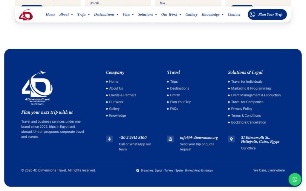
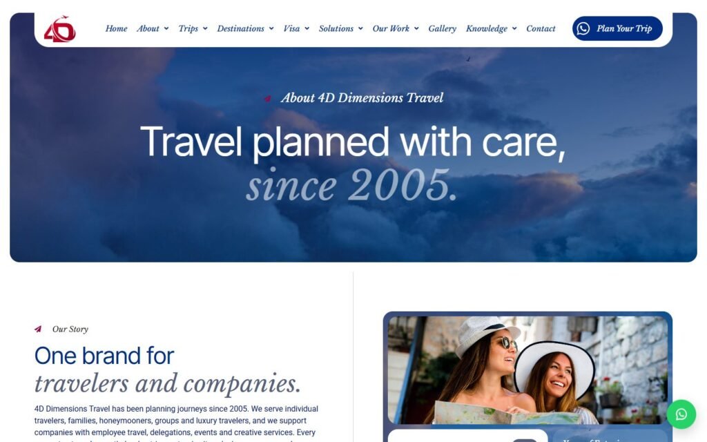
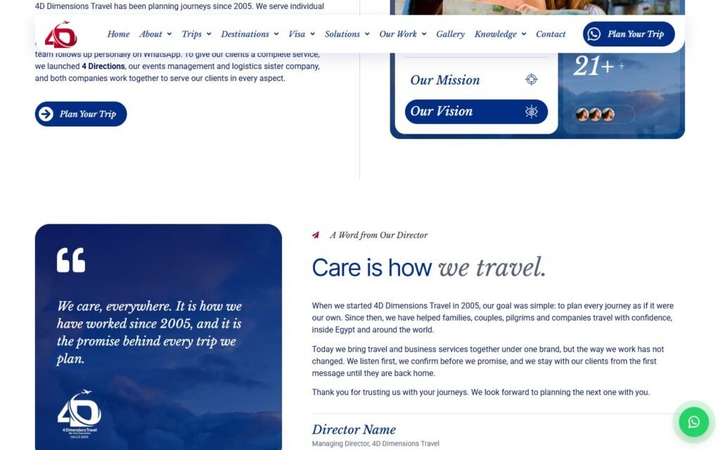
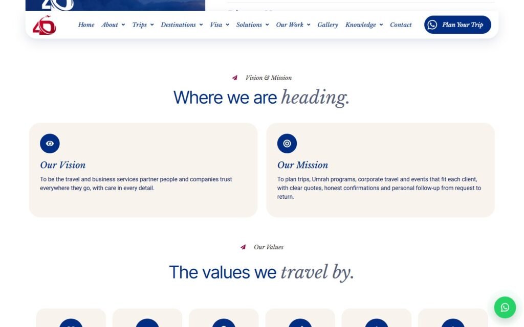
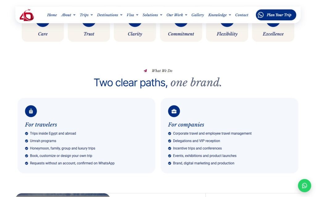
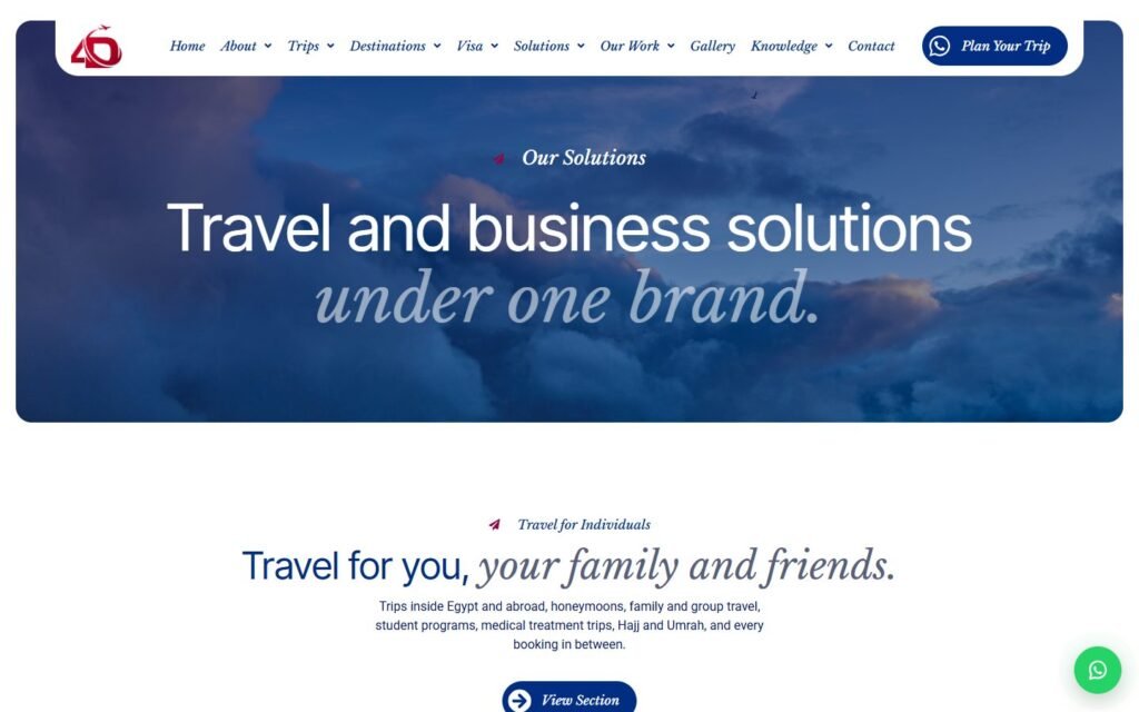
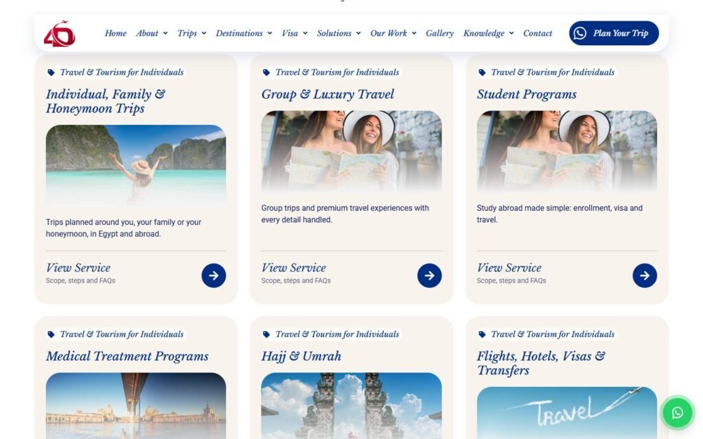
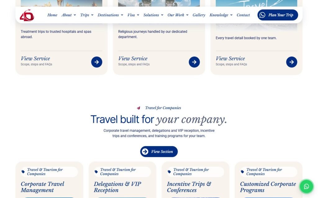
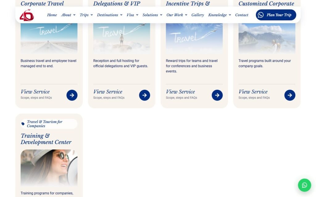
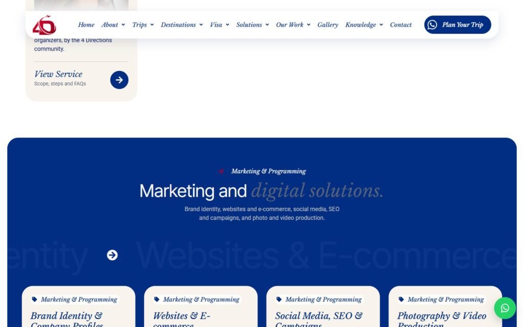
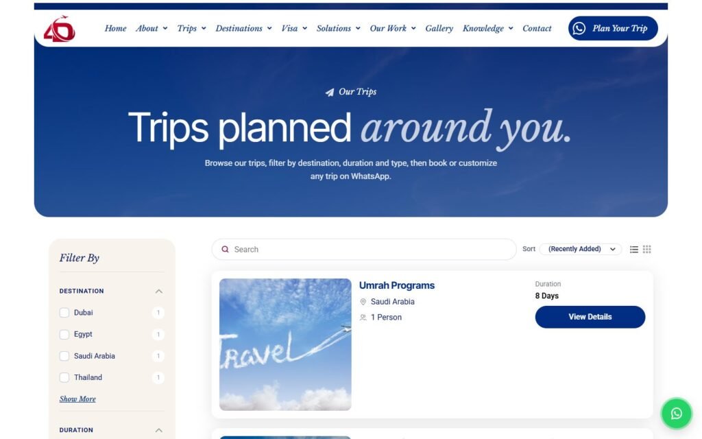
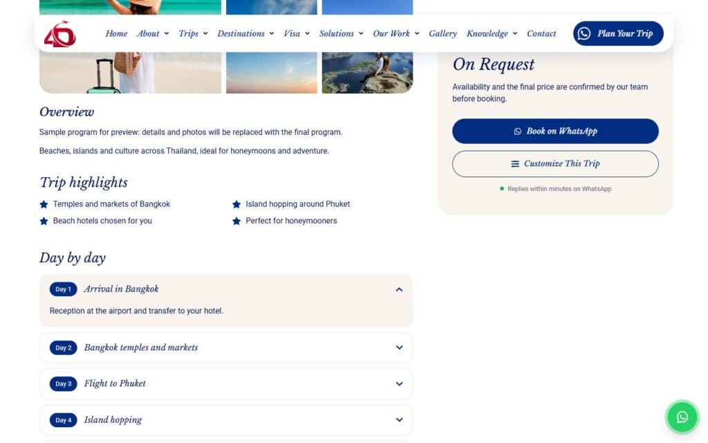
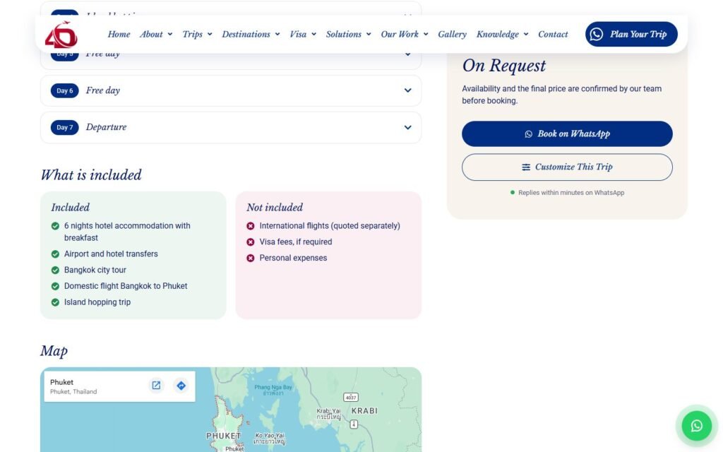
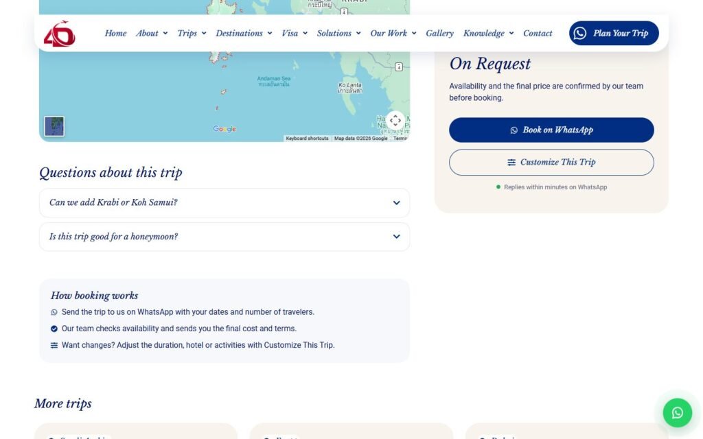
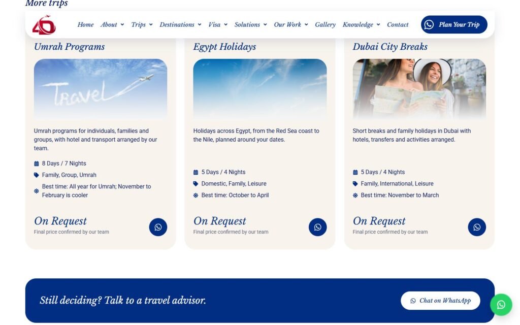
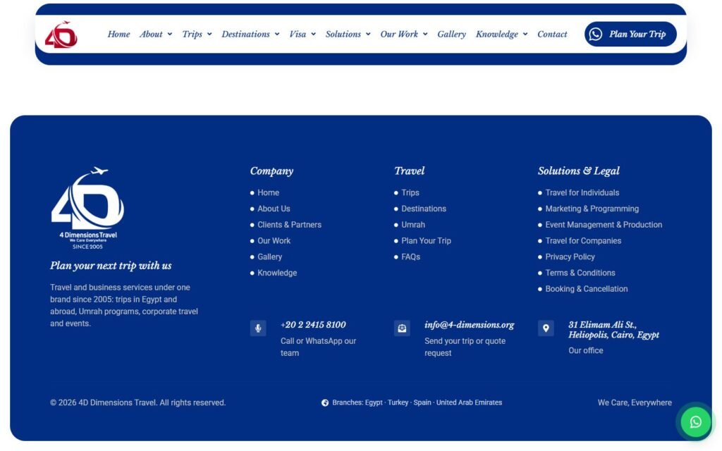
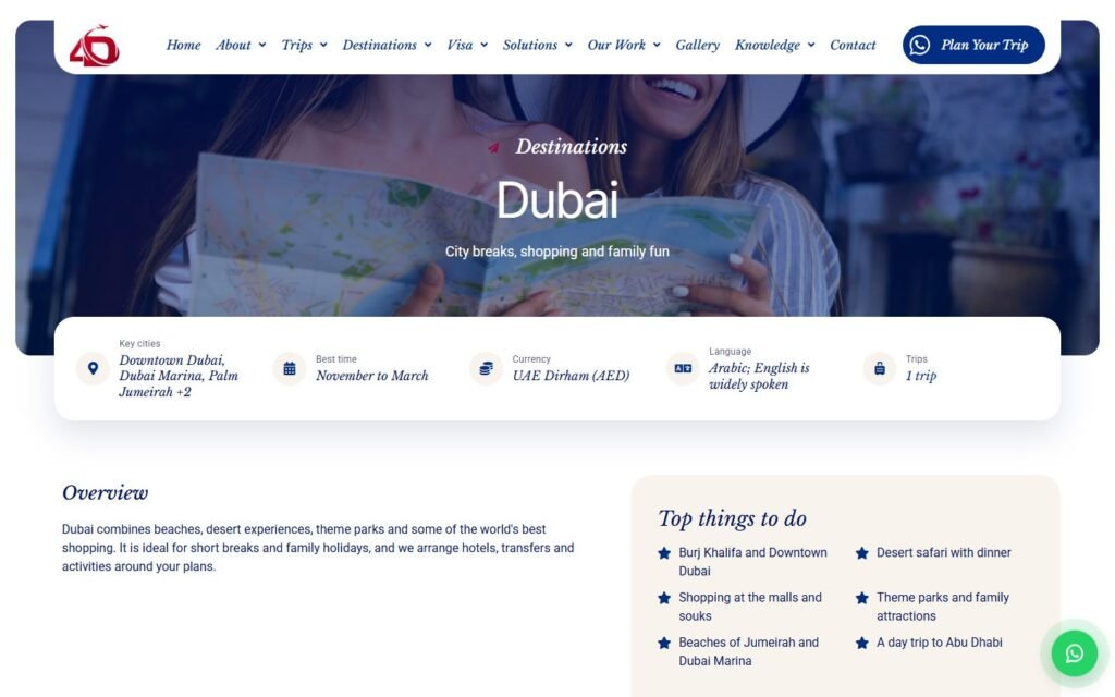
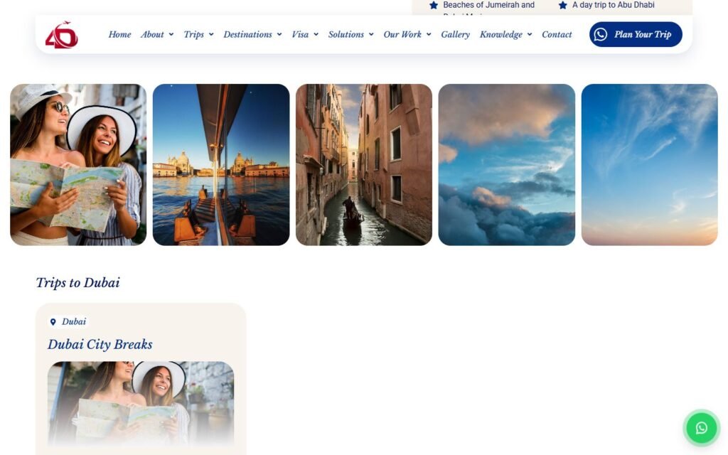
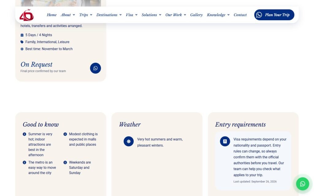
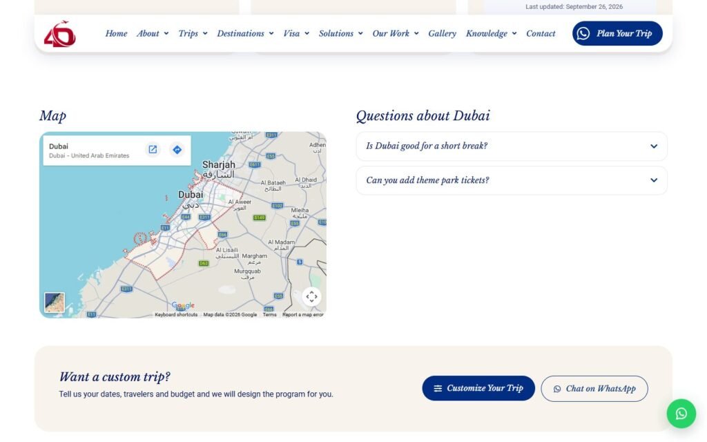
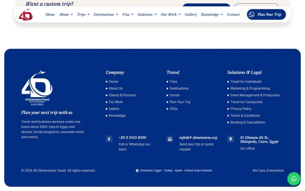
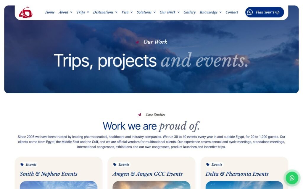
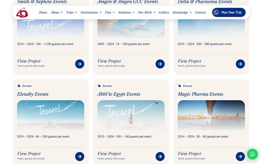
Inside the website
The parts of this build that do the actual work, and how each one is put together.
01
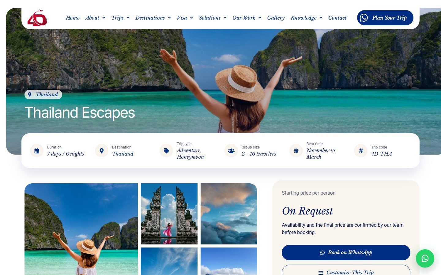
Booking that ends on WhatsApp
Travel here is quoted, not sold off the shelf, so there is no cart, no checkout and no customer account anywhere on the site. Every trip, destination, service and visa page ends in the same two actions: send a request, or open WhatsApp with the trip already written into the message.
How it is built
- The booking plugin ships a checkout flow; it is replaced by a custom single-trip template and never linked
- Requests become records in the dashboard with status, owner and notes, and export as CSV, instead of arriving as email
- The WhatsApp number lives in one settings field and feeds every button, the floating bubble and the footer
02
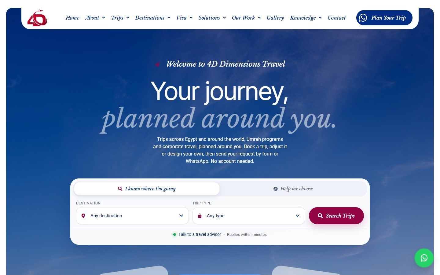
A finder for people who know where they are going, and for people who do not
Two very different visitors land on the same hero. One already has a destination in mind, the other only knows they want a holiday. Instead of one search box that half-serves both, the hero has two tabs: filter the catalogue, or answer a few questions and let the team come back with options.
How it is built
- Custom PHP block rather than a plugin widget, so both tabs share one layout and one style
- The filter tab routes to the trip listing by query string; the other tab posts to the planning form
- Icon selects and a red search button; the chips scroll sideways on mobile instead of stacking
03
Destinations, trips and visas stored as data, not as pages
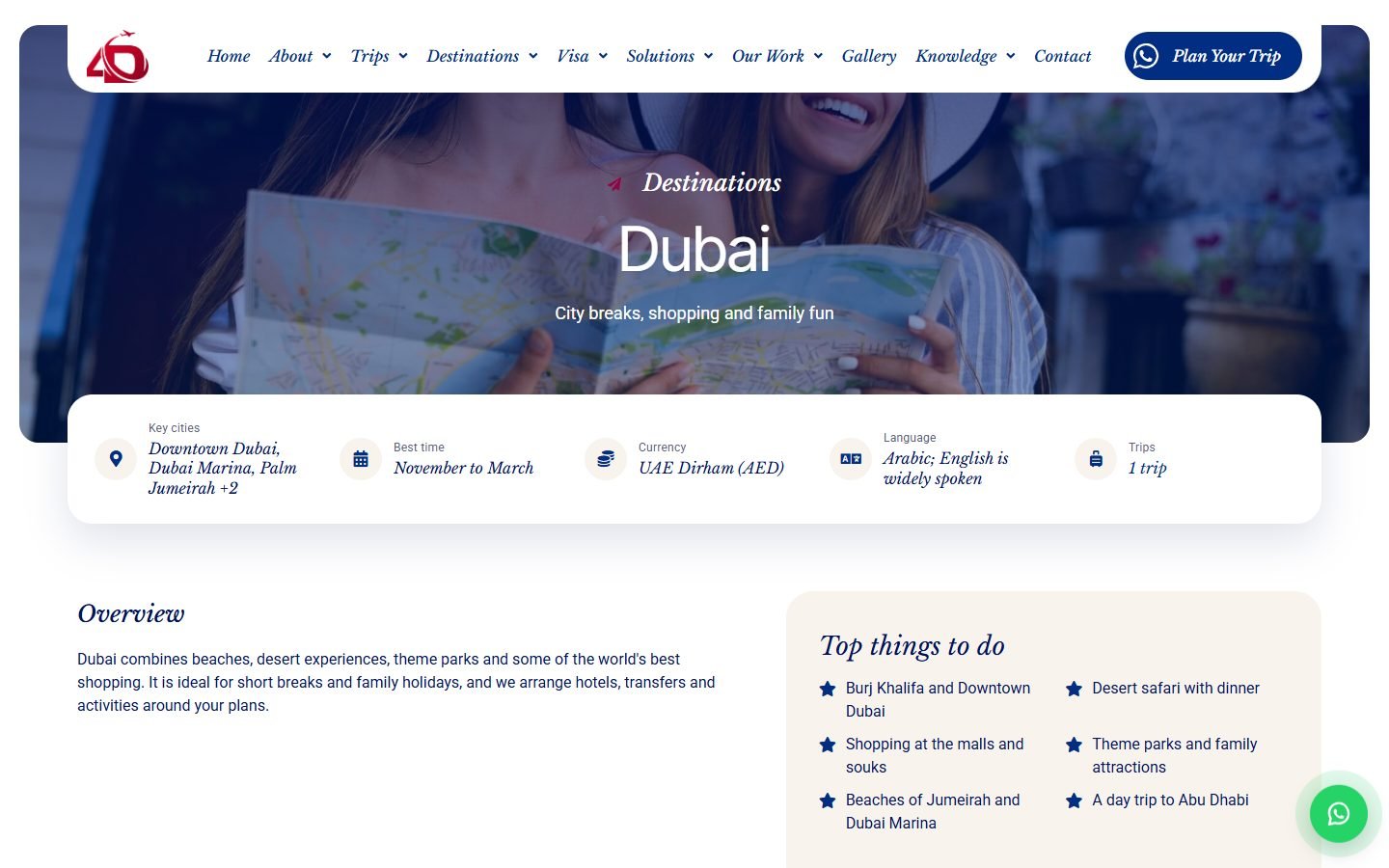
A destination guide answers practical questions first: key cities, best time to travel, currency, language, then what to do and which trips go there. The same applies to visas, with documents, processing time, fees and steps. None of it is typed into a layout, so adding Spain or a new visa is one entry, not a new page.
How it is built
- Destinations carry their own fields: intro, cities, best time, weather, currency, language, requirements, gallery, map and FAQs
- Visas are a separate content type with region, types, validity, fees, documents and steps; the Visa menu builds its own sub-items from them
- One template per type, so all seven destinations and every visa page stay identical in structure
04
A trip listing that works on a phone
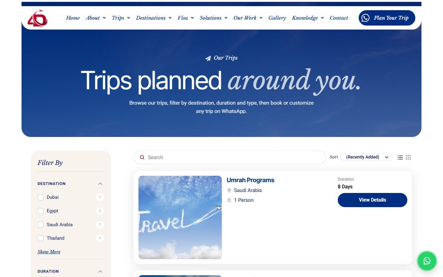
The catalogue is where people compare, and most of them do it on a phone. The filters move into a drawer with its own Show trips button, the price filter hides itself while prices are on request, and the listing keeps the brand instead of the plugin default.
How it is built
- The booking plugin archive is wrapped in a branded hero, a cream filter sidebar and a pill toolbar
- Custom checkboxes, slider and a mobile drawer with a shade; sticky sidebar on desktop
- All twelve main pages checked at 375px wide with no horizontal scroll
05
Proof instead of adjectives
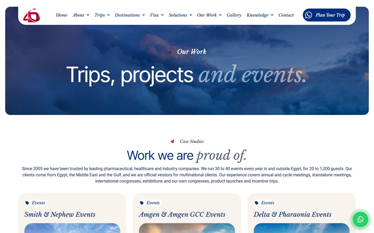
This company sells corporate events to pharmaceutical and petroleum clients, so the site had to show work, not describe it. Thirty-five client logos, eighteen real event histories with year, city and guest count, and an events section that sorts itself into upcoming and past.
How it is built
- Clients are a content type grouped by sector, feeding both the home marquee and the clients page
- Case histories carry year, guests and location as fields, so they stay filterable
- Upcoming or past is decided from the event date, never set by hand
06
Everything editable without a developer
The rule from the start was that the client team changes the site themselves. One 4D Site screen in the dashboard links every piece of editable content, and the numbers, the director word, the branches and the contact details are settings that appear wherever they are used.
How it is built
- Company figures, founding year, director name, title, photo and message are option fields injected into the layout as tokens
- Branches, phone, email, address and social links are set once and render in the header, footer, contact page and every link
- A Duplicate action on trips, events, services, visas, testimonials and clients, so adding the next one is a copy and an edit
Need something like this for your brand?
Tell me about your project. I will map the structure, the integrations and the launch plan.